Work / VDP1093
UI/UX Design
VDP1093
Residential communication and remote access interface. Interface design, icon system, and interaction structure for a residential video door phone used for everyday home security and communication.
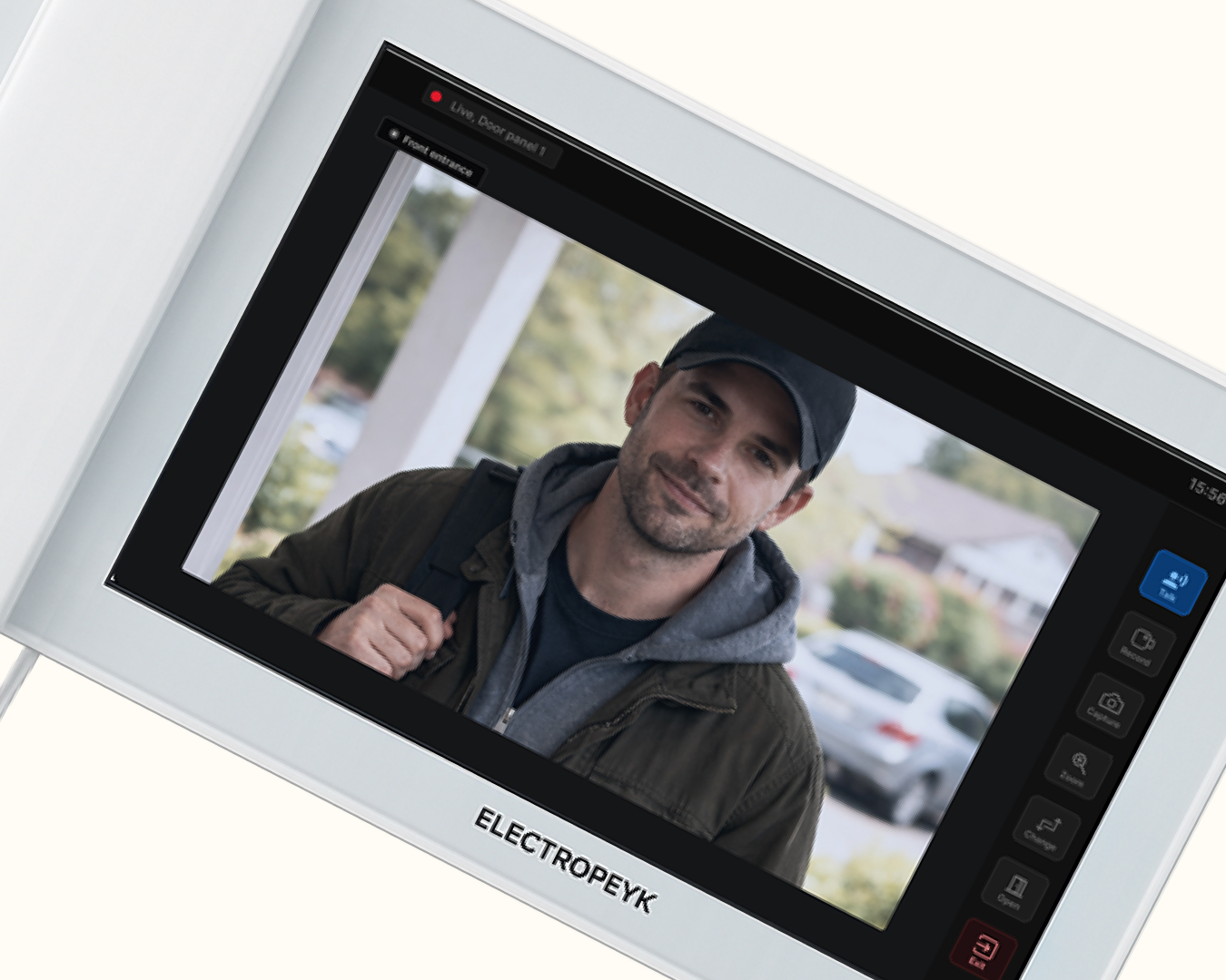
Residential communication and remote access interface. Interface design, icon system, and interaction structure for a residential video door phone used for everyday home security and communication.
Residential video door phones are everyday security devices used by people with very different levels of technical familiarity. The interface needs to support quick decisions during short and sometimes unexpected moments, such as responding to a visitor, checking the camera, or opening the entrance door.
However, many existing systems at the time relied on complex menus, small touch targets, and technical terminology, which made interactions slower and less intuitive. The challenge was to translate the technical capabilities of the system into a clear and reliable interface that residents of different ages could use quickly and confidently.
The visual interface and interaction flow for a residential video door phone, used for everyday home security and communication.
Make the main actions easy to recognize.
Reduce the number of steps when interacting with visitors.
Create a calm and trustworthy interface suitable for home environments.
Because video door phones are used in everyday home environments, the interface needs to work for people with very different levels of technical familiarity. Looking at existing devices and typical household use showed that residents interact with the system in short, practical moments rather than long sessions. The interface therefore focuses on quick recognition of actions and immediate use, instead of complex navigation.
Fast recognition is more important than deep navigation.
Large touch targets help reduce interaction errors.
The system should feel calm and trustworthy during stressful moments.
| Pain Point | Design Response |
|---|---|
| Small buttons cause mis-taps | Large icons and clear spacing |
| Technical language confuses users | Simple wording and universal icons |
| Too many menu layers | One-level main menu, icon grid |
| Stressful situations need confidence | Calm colours and clear hierarchy |
Interaction with a residential video door phone usually happens in short, practical moments. The most common situation is when a visitor arrives at the entrance and the resident needs to quickly see who it is and decide whether to communicate or open the door. Residents can also use the device for internal communication within the building.
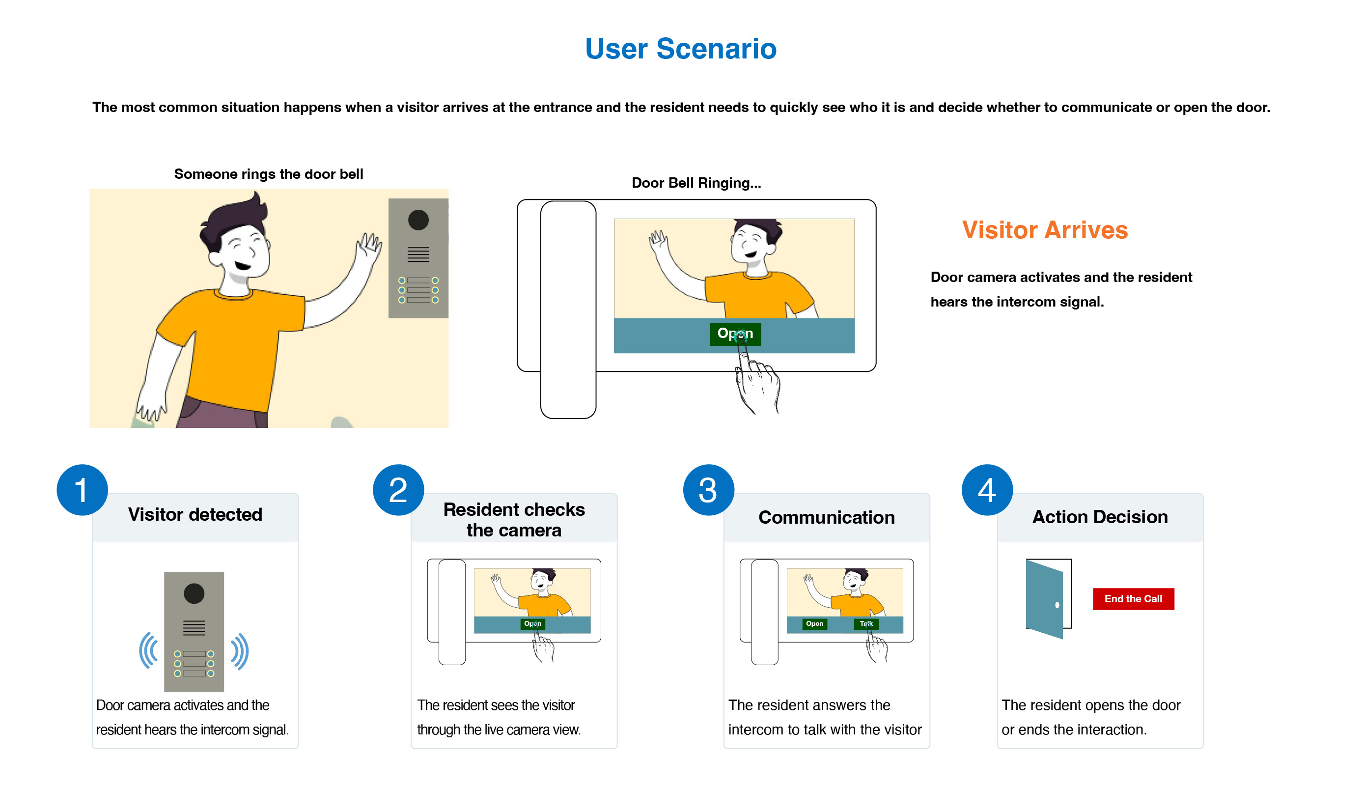
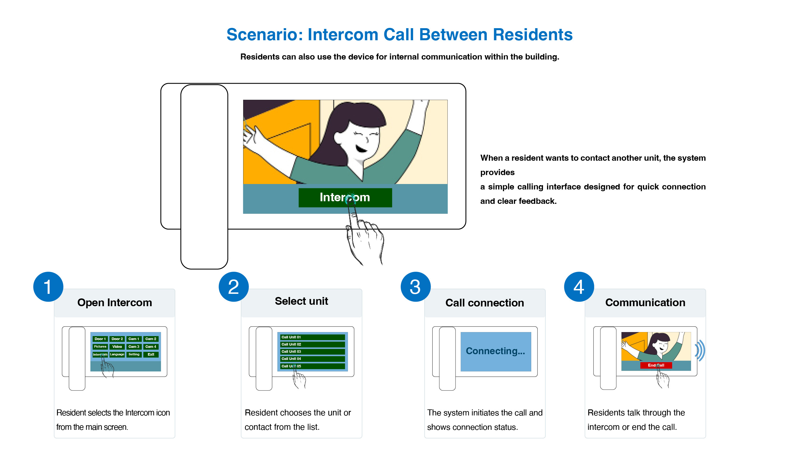
Designing a residential video door phone requires balancing clarity, speed, and reliability. Because interactions often happen in short or unexpected moments, the interface needs to support quick recognition and minimal effort. The design therefore focuses on simplifying the interaction model while keeping the most important actions easy to access.
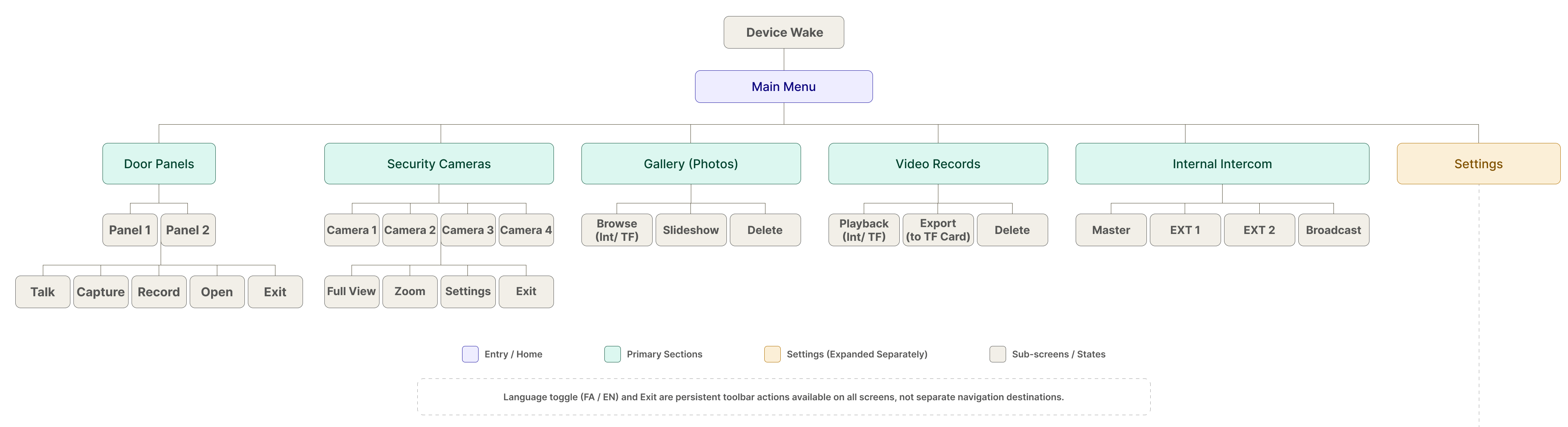
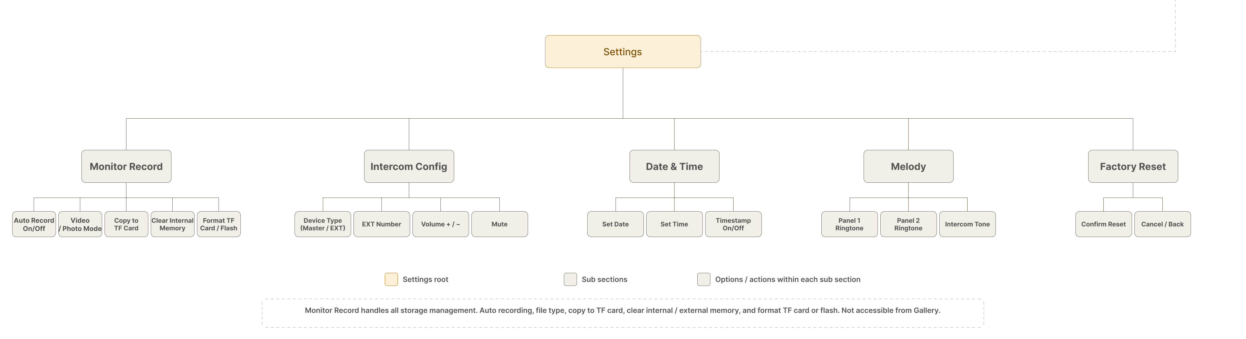
The system was organized into clear groups, door control, surveillance, media, and intercom, so users can find key actions quickly and without confusion. Settings are placed in a separate section to keep main tasks simple and uninterrupted, while still allowing full control over device configuration.
Fourteen screens across the core user flows were designed at low fidelity, to focus on layout, hierarchy, and navigation before applying visual treatment. Key decisions, sidebar navigation in settings, the right-side toolbar in camera view, and the confirmation modal pattern, were validated at this stage.
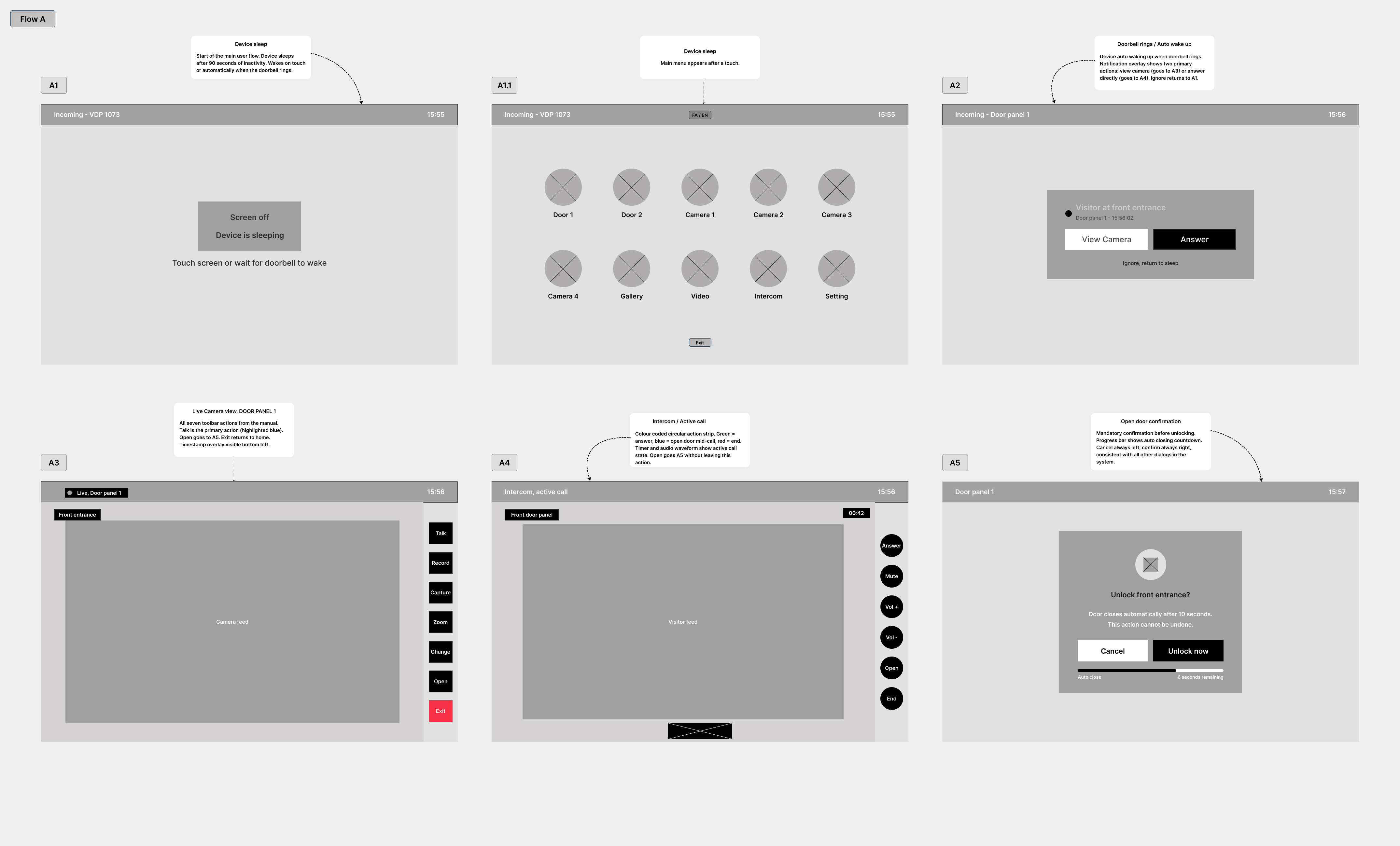
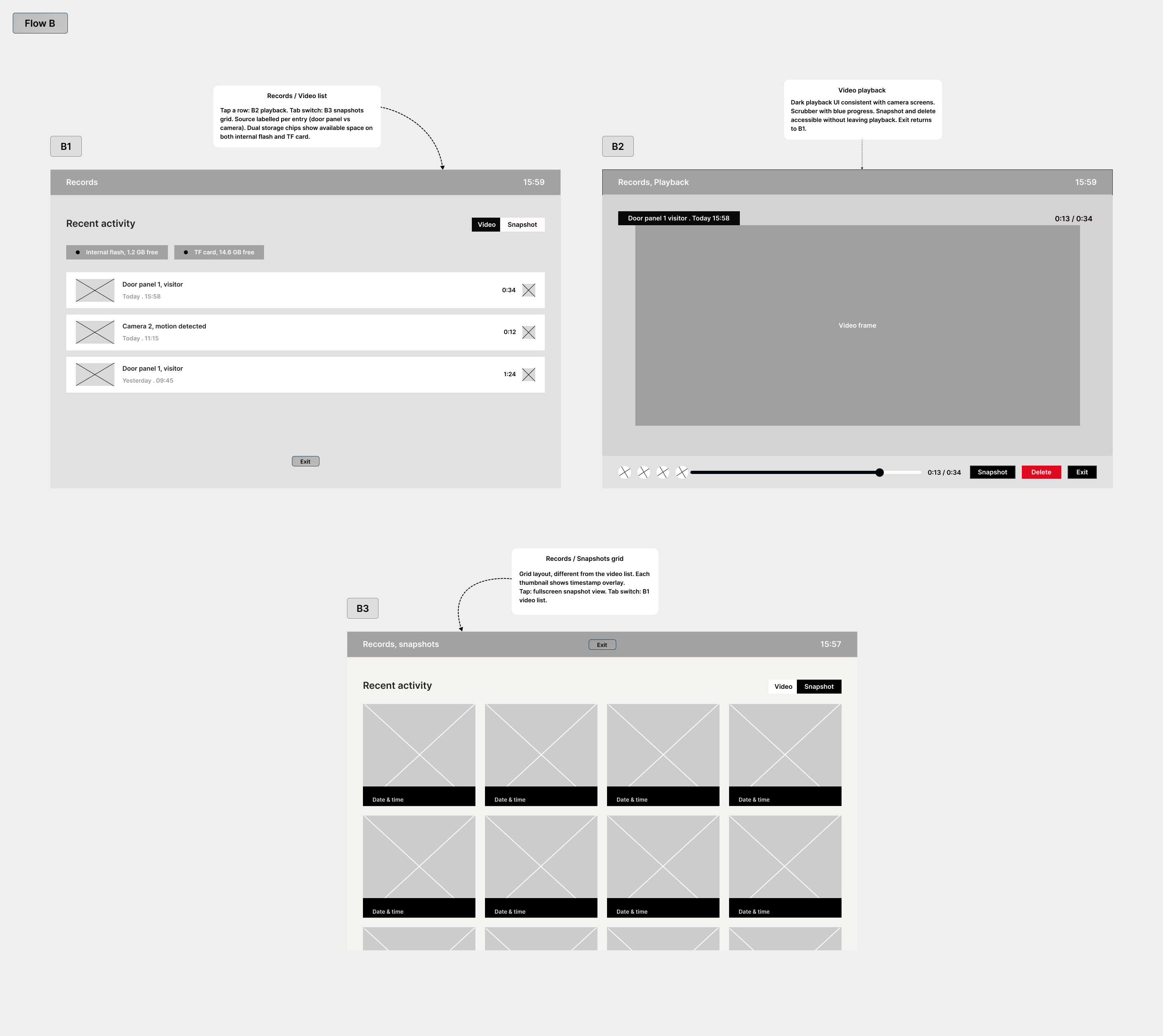
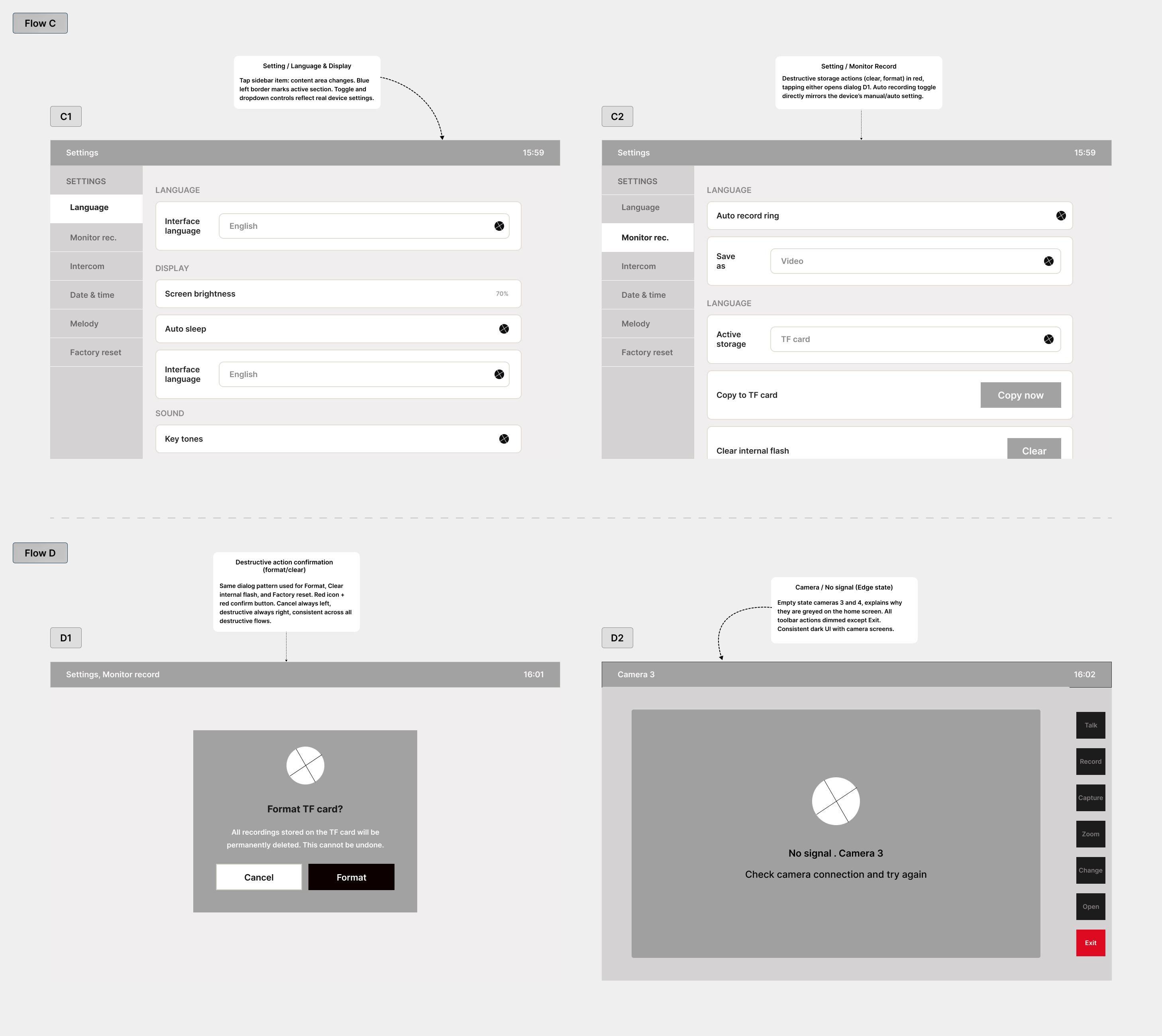
The final screens span the full device experience, the visitor flow, records, and settings. Designed for a 10-inch landscape touchscreen used by mixed-age households, with large touch targets, a single accent colour, and a dark and light split mode that keeps camera feeds immersive while menus stay calm and readable.
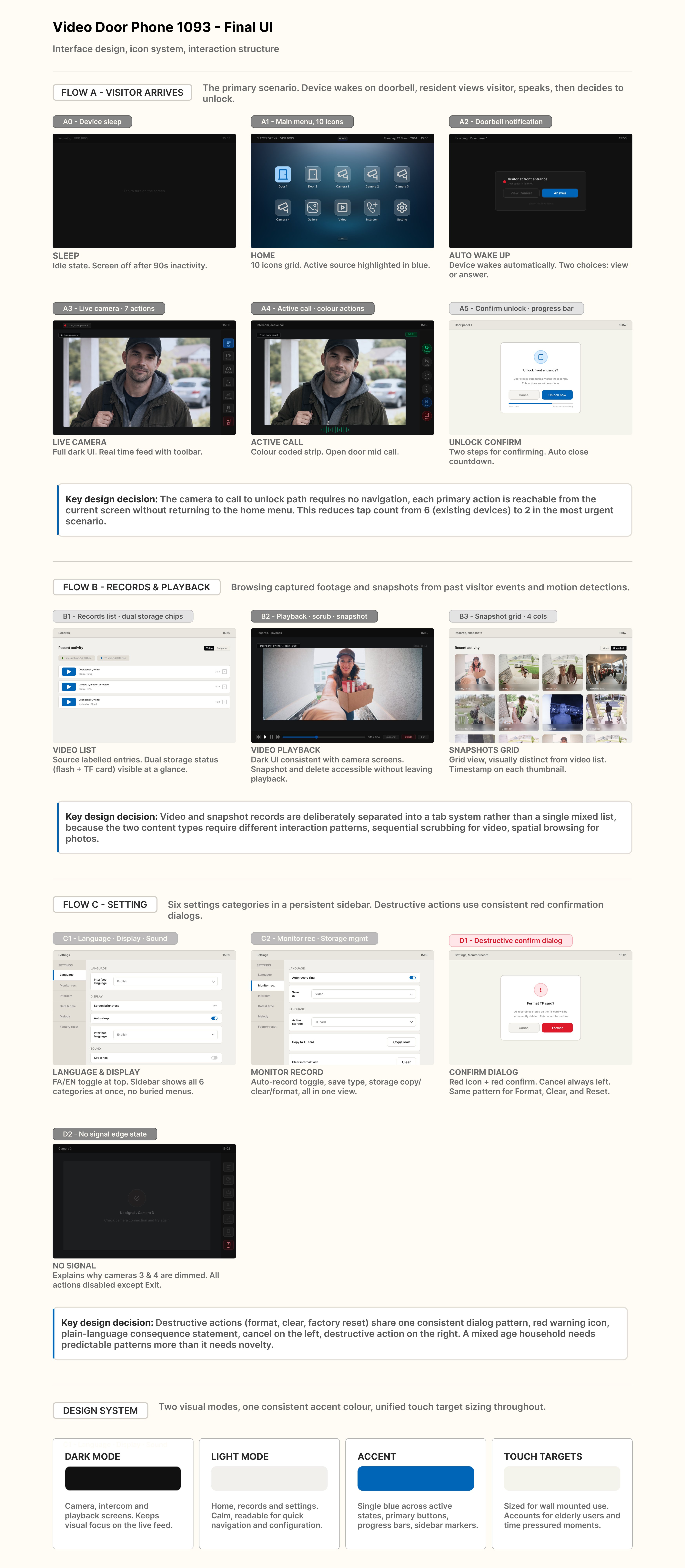
The visual interface and interaction flow for the device were designed within Electropeyk's R&D Department, covering navigation and information hierarchy, the icon set and visual language, the core screens for camera, intercom, records, and open door, and usability thinking for mixed-age households.