Streamlining industrial inspection through strategic UX. Building a website's UX strategy, information architecture, and interface design from zero for a new industrial inspection company.
ISIQueue is a new industrial inspection company in The Hague with no digital presence. The challenge was to build a strong and credible foundation from the beginning in a field where trust is essential.
Since there were no existing users to interview, the research focused on reviewing competitors. I looked at 10 inspection and certification websites in the Netherlands and EU, and the goal was to understand where companies in this field often fall short, and use those insights to guide the design decisions.
The journey map showed that industrial clients follow a careful and structured process. They first check credibility, then explore services, and only reach out when they feel confident.
This led to three clear design priorities. Build trust from the first moment, present services in a way that is easy to scan and understand without technical knowledge, and keep the inquiry process short and simple.
Clear credibility signals on homepage, certifications visible
Cautious / risk-awareTechnical terminology, too much engineering language, unclear service differentiation
Clear credibility signals, certifications visible, industry sectors listed early
EvaluatingTechnical terminology, too much engineering language, unclear service differentiation
Modular service blocks, clear summaries before technical depth, structured navigation
AnalyticalLong forms, unclear next steps
Trust indicators, process explanation, professional visual language, clear hierarchy
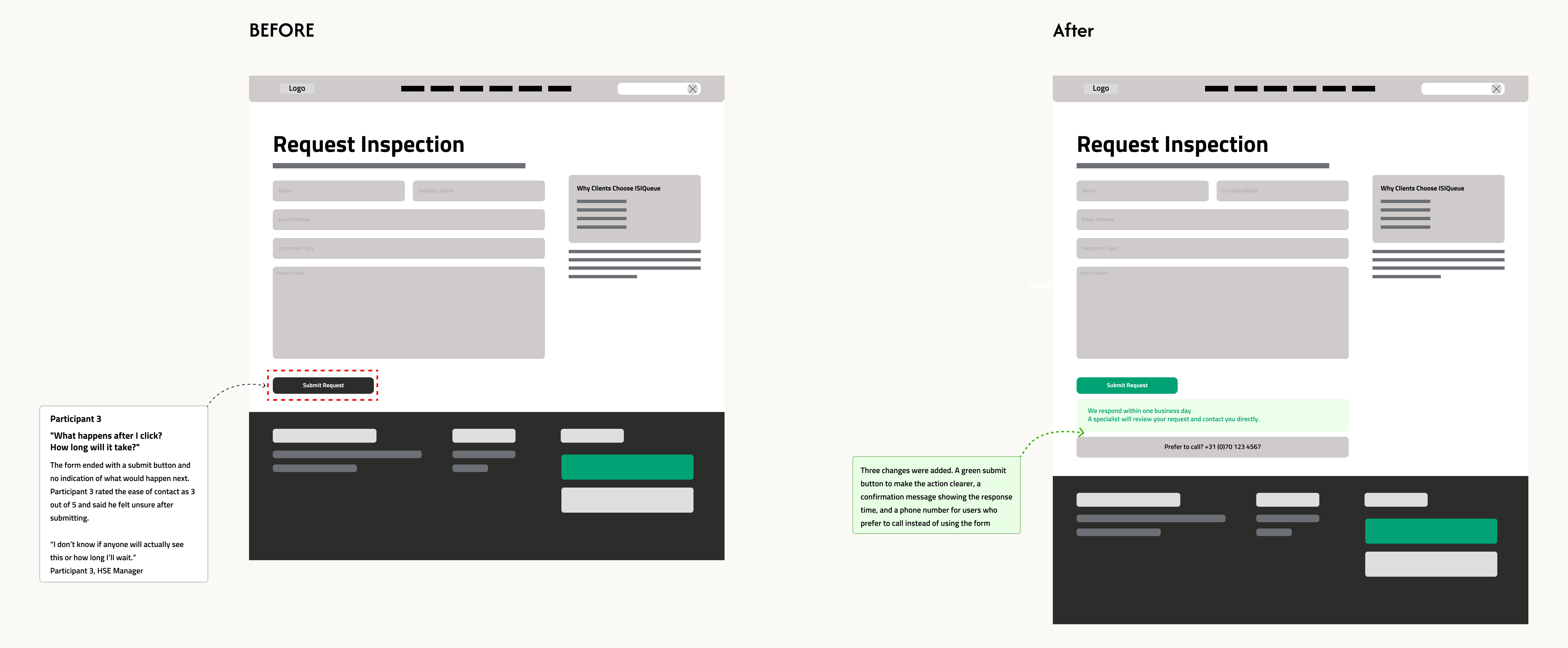
DecidingConfirmation message with clear next steps and response time expectation, clear follow up expectation
Relieved but waitingThe competitive analysis revealed a consistent six-part navigation structure across all 10 benchmarked sites. Rather than adopting this wholesale, the ISIQueue architecture was adapted to the company's current stage.
| Website | Services | Industries | Expertise | Resources | About | Contact / CTA |
|---|---|---|---|---|---|---|
| SGS | ||||||
| Bureau Veritas | ||||||
| TÜV SÜD | ||||||
| DEKRA | ||||||
| TÜV Nord | ||||||
| DNV | ||||||
| RINA | ||||||
| LR (lr.org) | ||||||
| KIWA | ||||||
| ISIQueue |
The table shows the navigation structure across all 10 benchmarked sites, and how ISIQueue's architecture was deliberately adapted from the industry pattern.
Design assumptions about how the interface may influence user behavior after launch.
| Goal | Design Intervention | Expected Impact | Future Metrics to Track |
|---|---|---|---|
| 01 Improve the quality and clarity of service requests |
Modular service categories, clear service descriptions, structured contact form | Fewer vague inquiries, more complete service requests | Inquiry form completion rate, percentage of complete submissions |
| 02 Reduce cognitive load |
Clear information hierarchy, service summaries and visuals, industry filters | Lower time to understand, higher visitor confidence | Time spent on service pages, bounce rate |
| 03 Strengthen trust signals |
Visible certifications, industry references, partner logos and standards | Higher perceived credibility, more qualified visitors | Scroll depth on About / Standards pages, return visitor rate |
| 04 Improve the conversion flow |
Consistent CTAs, simplified form with 4 fields, confirmation and next steps | Higher inquiry completion rate, fewer drop offs in the form | CTA click through rate, form abandonment rate |
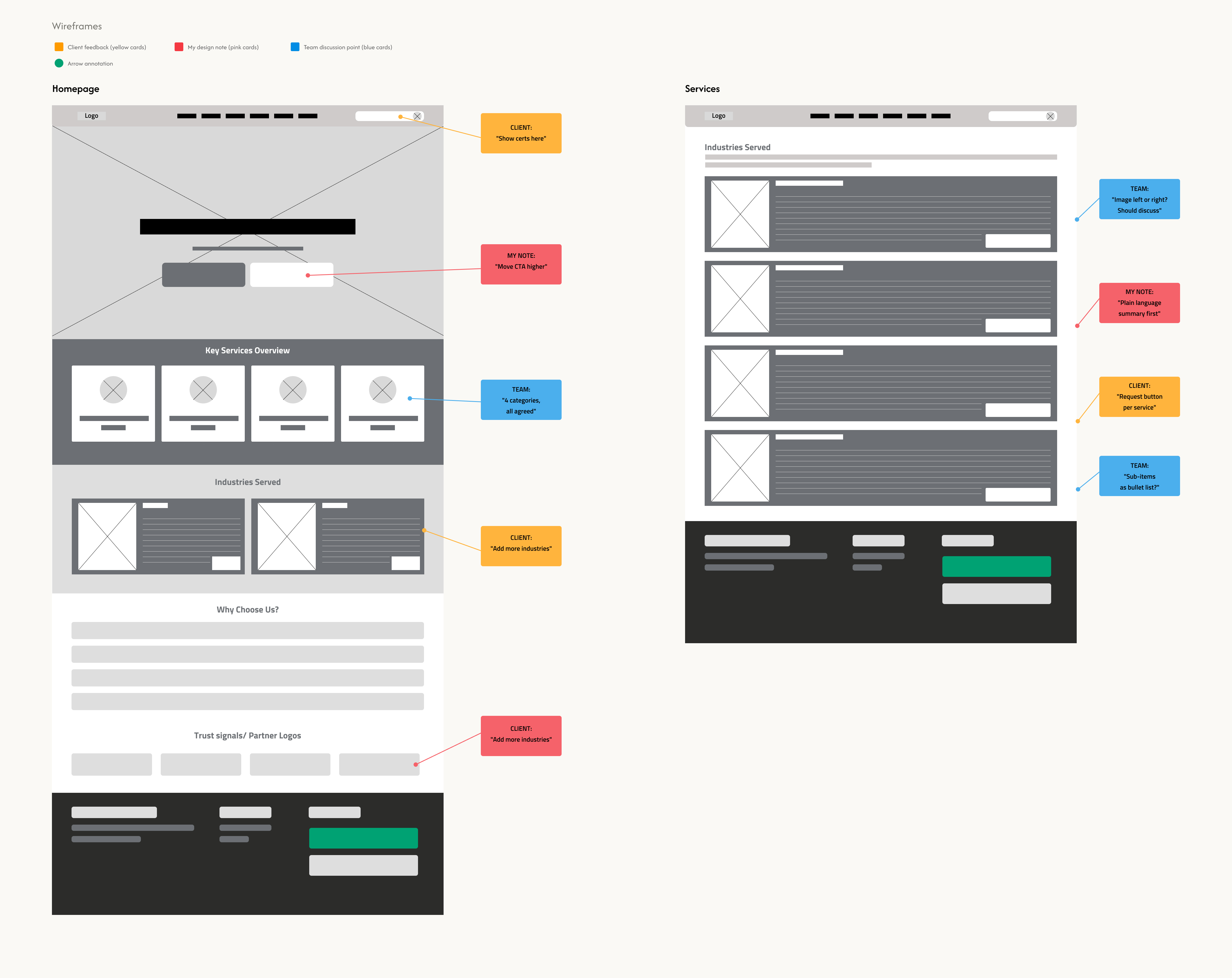
The wireframes were reviewed together with the client and a WordPress developer. The feedback focused on making the navigation clearer and improving the placement of calls to action. Based on this, the services were grouped into four main categories.
The desktop wireframe was tested with three participants from industrial and technical roles: a plant operations manager, a quality and compliance engineer, and an HSE manager. Each session lasted about 20 minutes. Participants completed four tasks: understand what the company does, find the right service, check trust signals, and submit an inspection request.
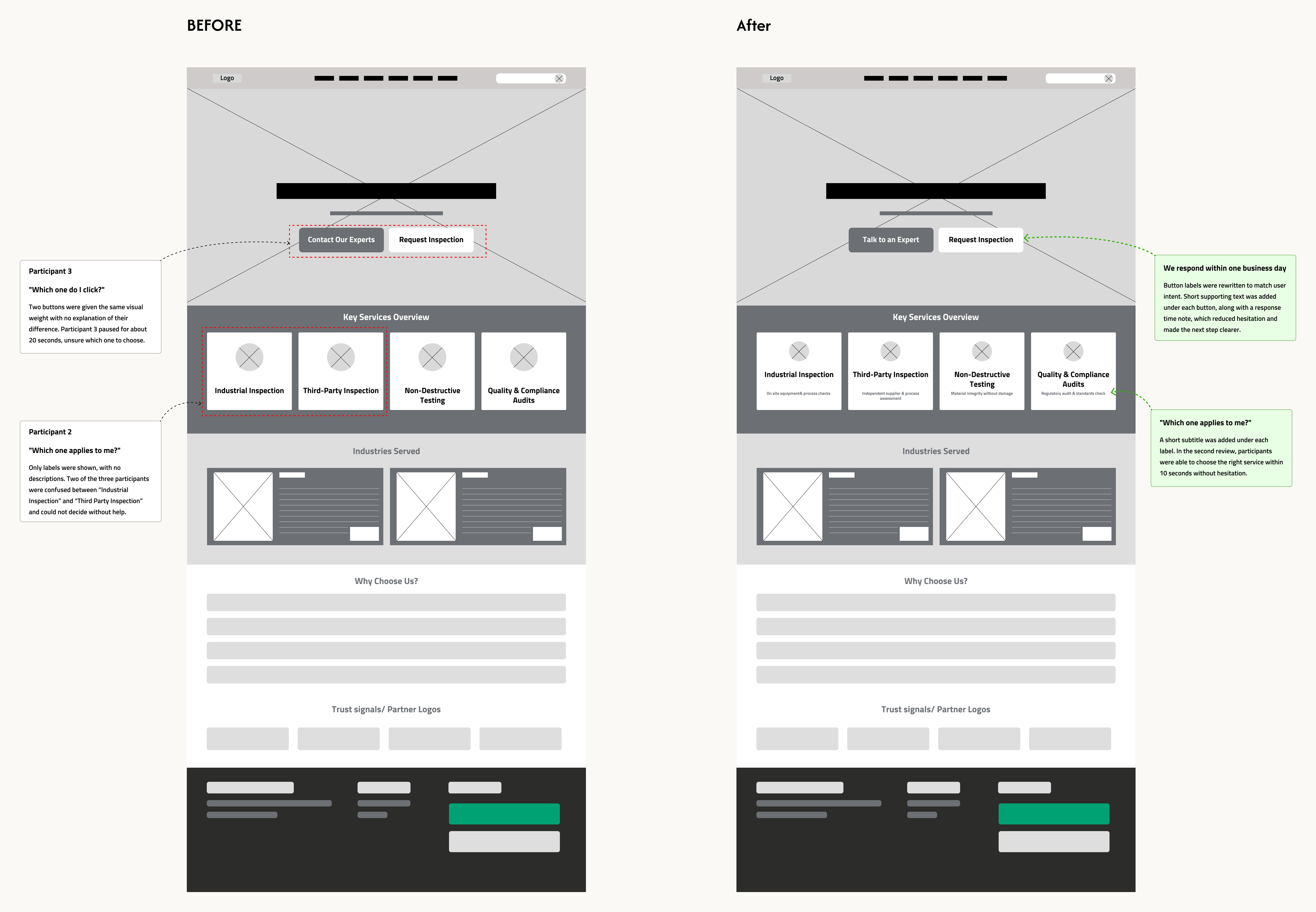
Two of the three participants hesitated when choosing between "Industrial Inspection" and "Third Party Inspection" because the difference was not clear without a short explanation.
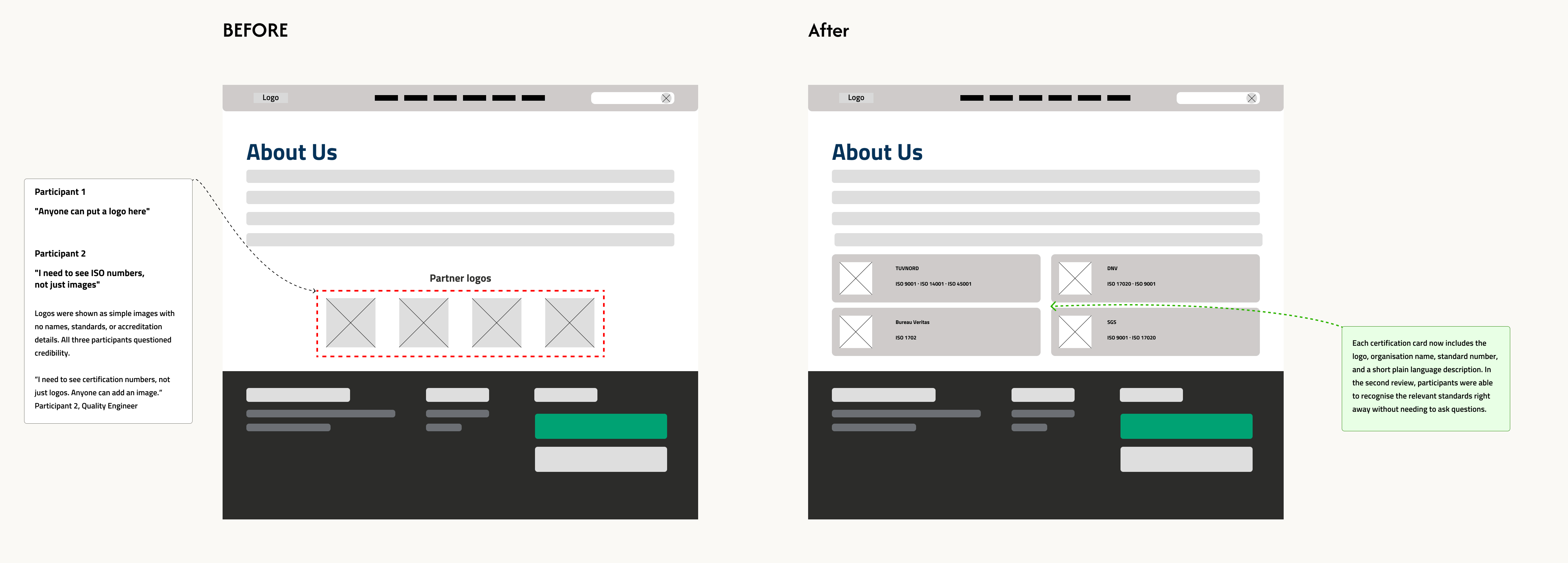
All three participants looked for accreditation bodies and certification standards. One participant rated trust as 2 out of 5 and said she would leave the site if she could not find them.
Participant 3 paused when choosing between "Contact Our Experts" and "Request Inspection" because it was not clear which one to use. The labels needed to be more specific.
After clicking "Request Inspection," participants expected to see what would happen next. Without a clear response time, their confidence in the process dropped.
All three participants understood the company's purpose within 30 seconds. The four service categories were clear and easy to follow.
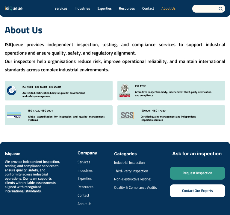
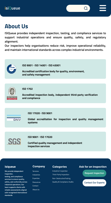
All three participants noticed the logos on their own. The placement worked well, but they expected more detail to support them.
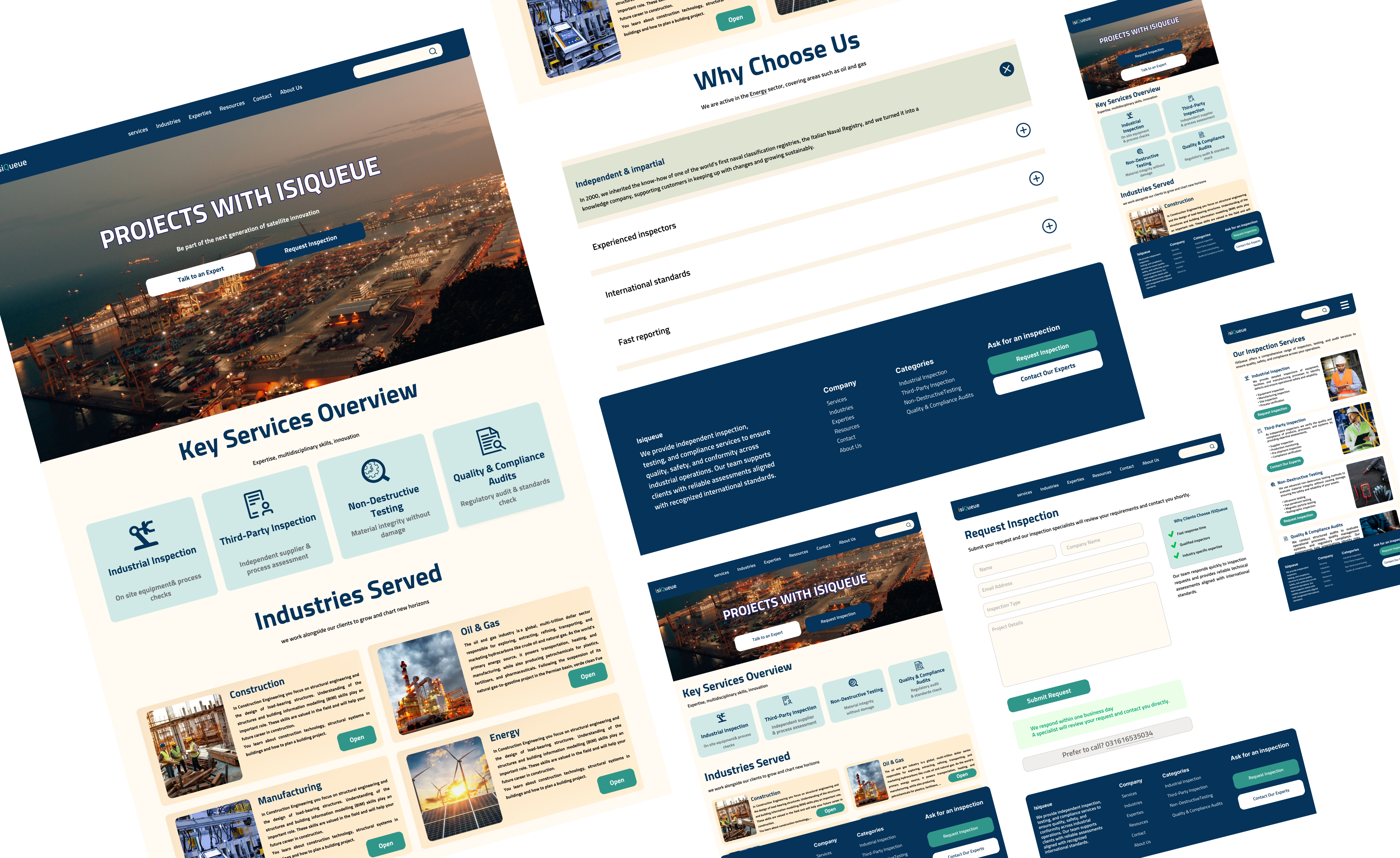
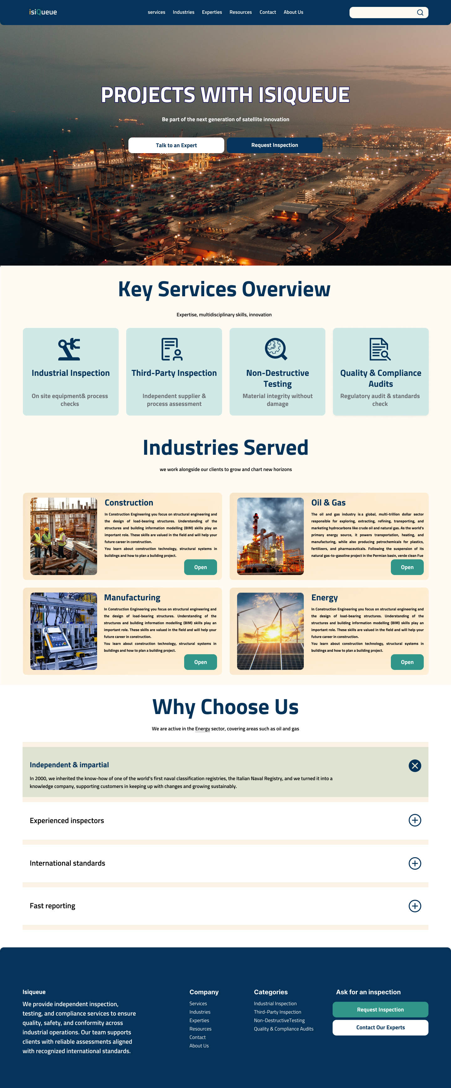
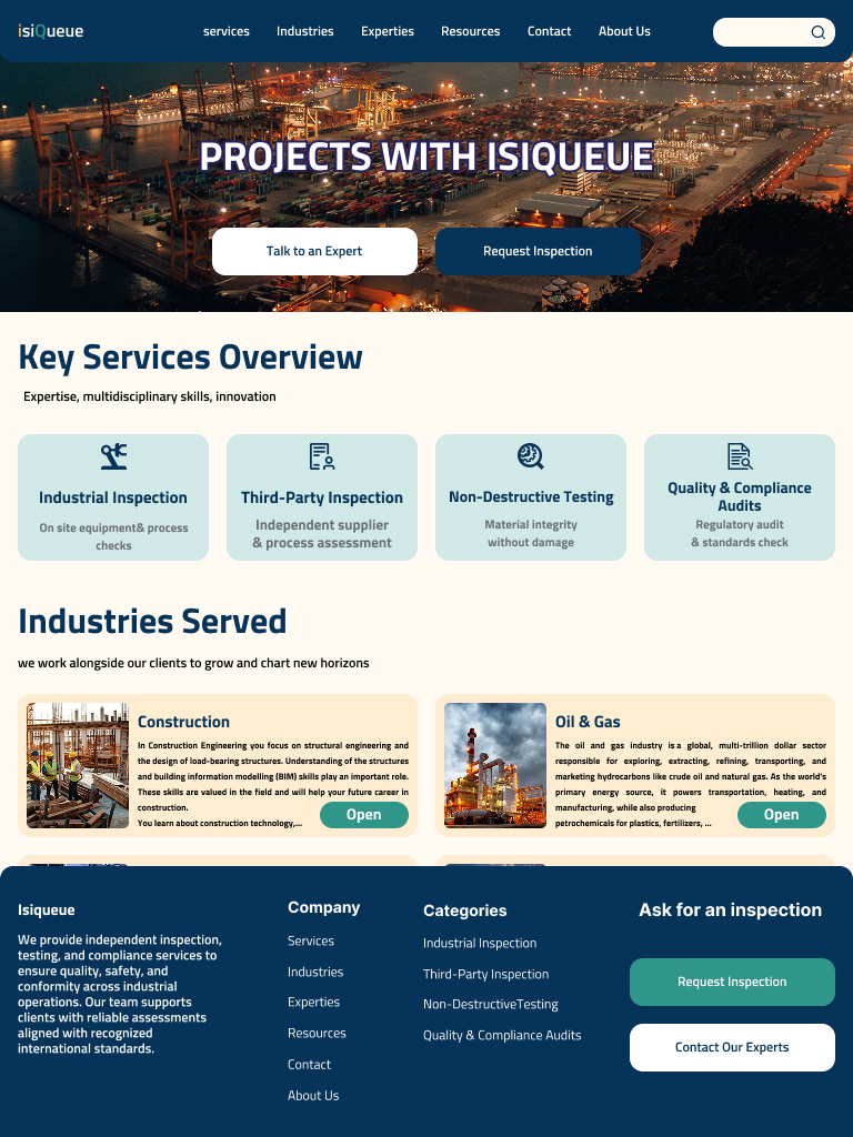
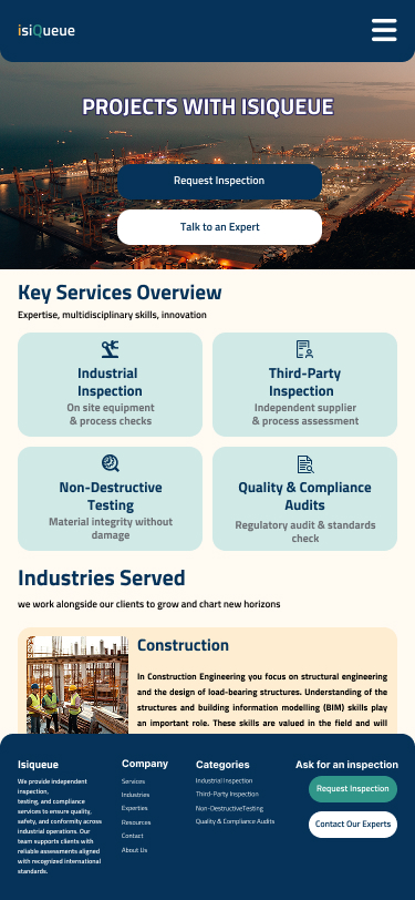
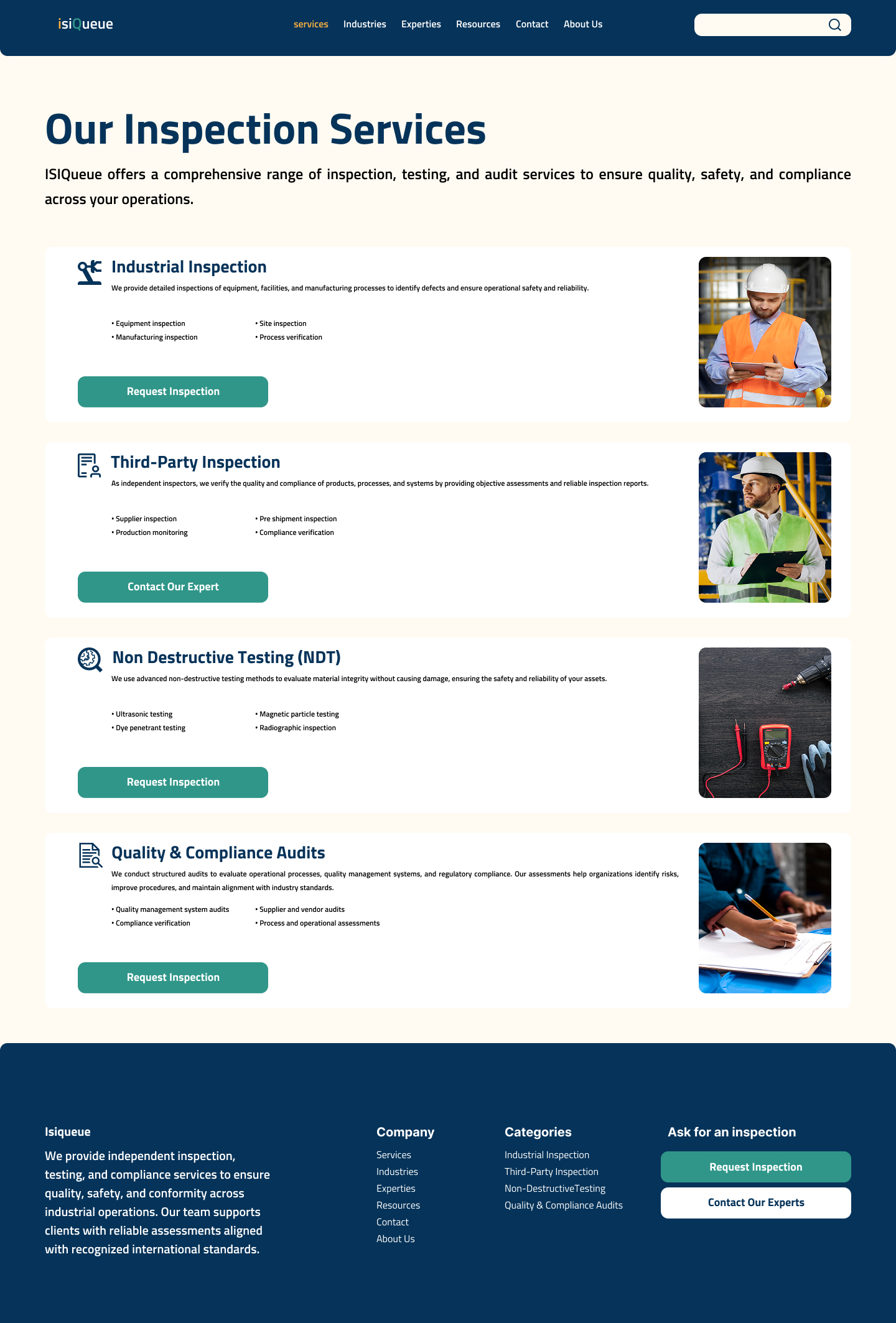
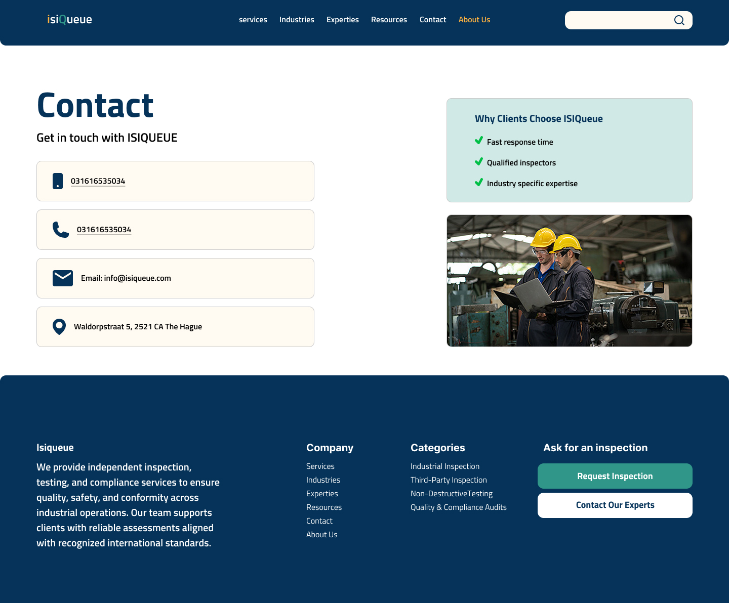
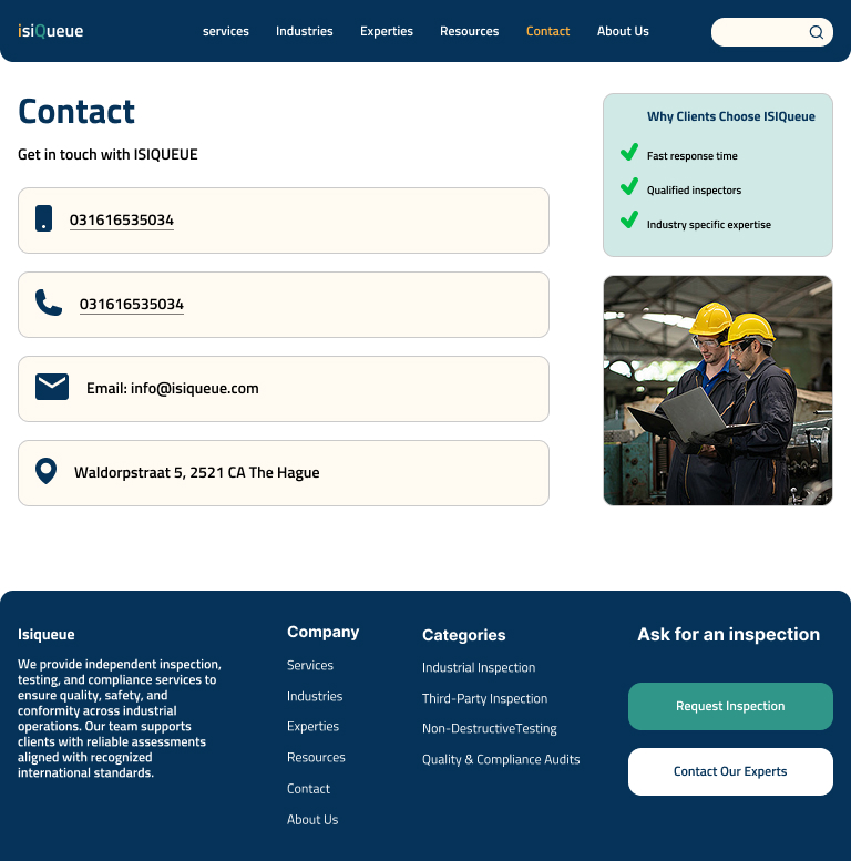
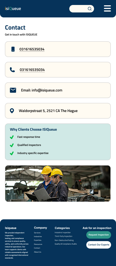
The final interface focuses on clarity, credibility, and a clear structure for presenting services. The homepage introduces the main inspection services, the industries the company works with, and simple calls to action that guide users to request an inspection or contact an expert.

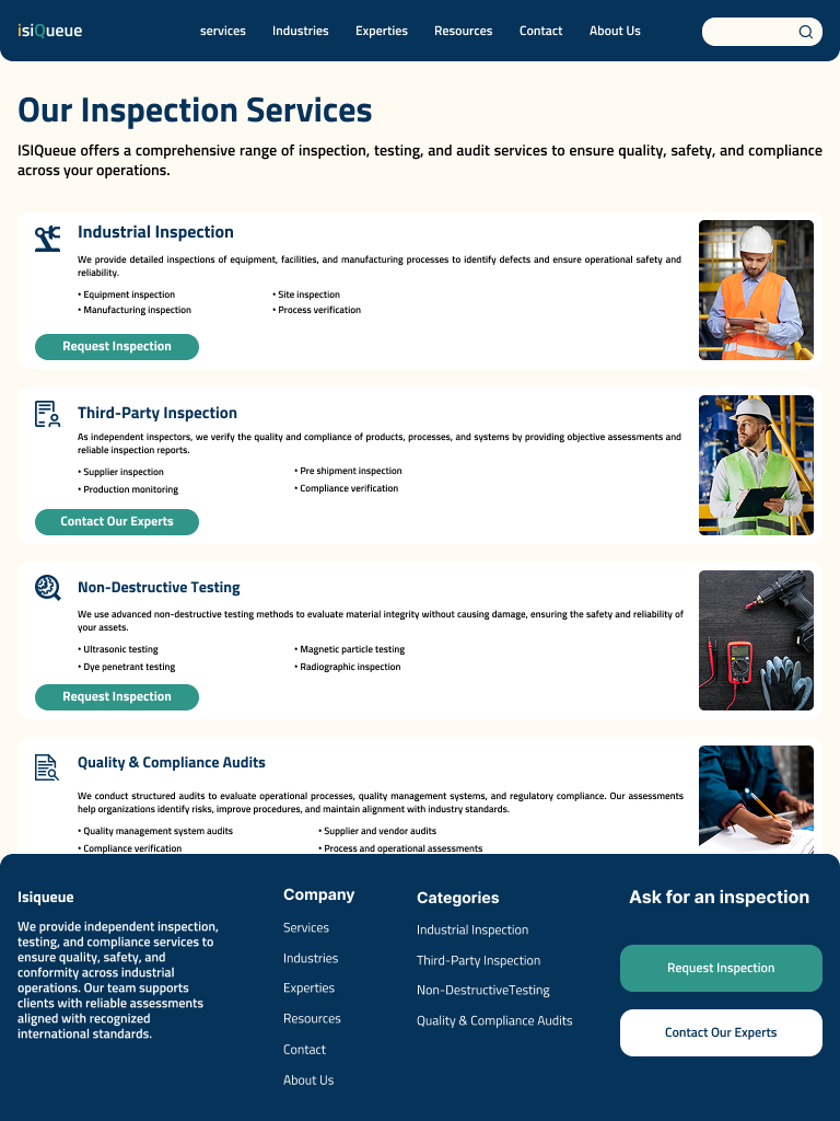
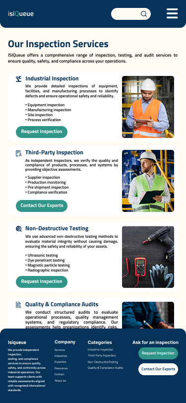
Services are organized into clear categories to make the inspection offerings easier to understand. Service cards help users quickly see what inspections are available and move to the detailed service pages.

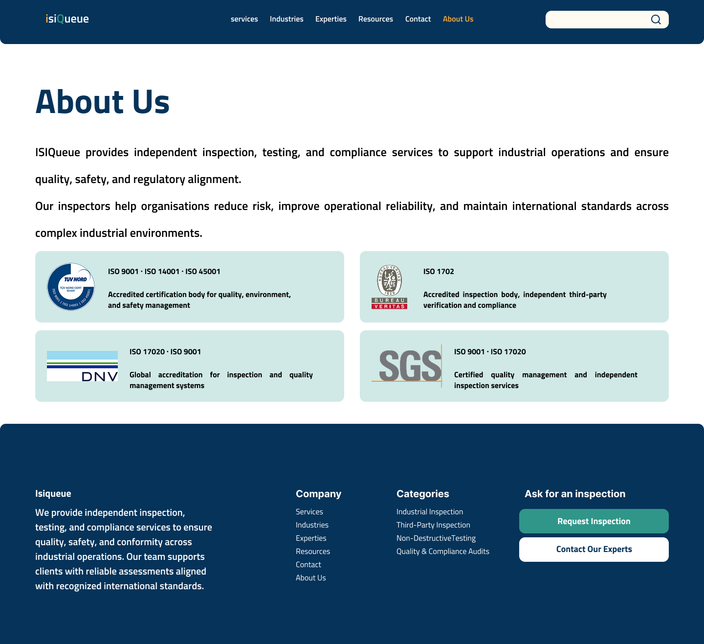
Since inspection services are often part of high risk industrial decisions, the interface focuses on building trust through clear signals like certifications, industry partnerships, and professional imagery.

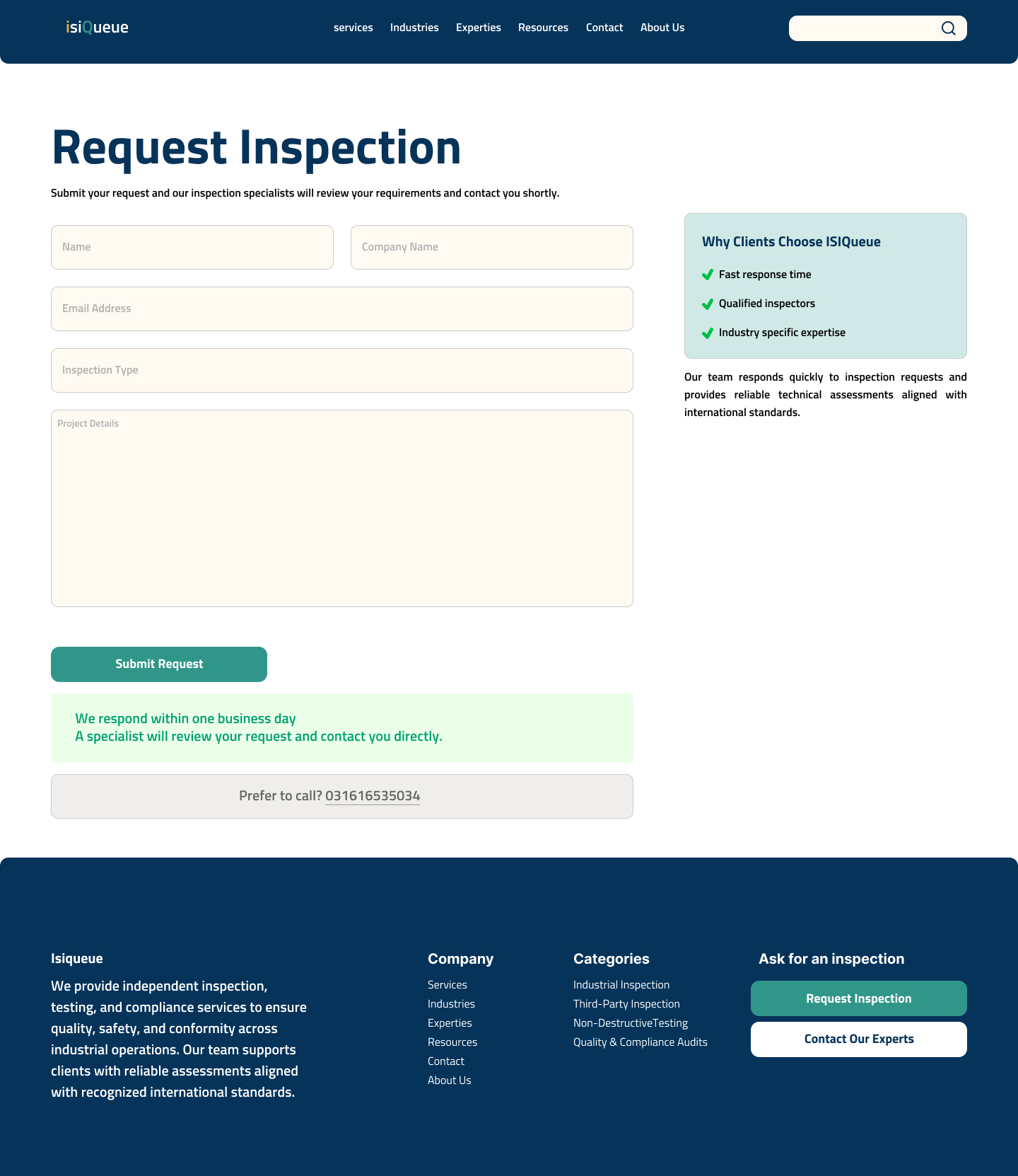
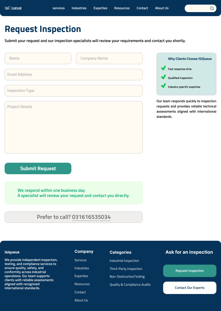
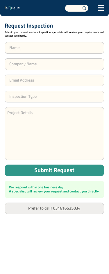
A simplified inspection request form reduces friction in the inquiry process. It focuses on essential information so clients can quickly submit their inspection needs.


The prototype was developed using Claude, an AI system by Anthropic, guided through detailed design specifications including color palette, layout rules, component behavior, and interaction logic. This process enabled the creation of a production ready interactive HTML prototype, significantly reducing prototyping time while maintaining full design fidelity.
Starting from zero, with no users, no analytics, and no existing design, meant that every decision had to rely on research and careful judgment.
One of the main challenges was working within the limits of an early stage project. ISIQueue is still new, so sections like Expertise and Resources were not included. This was not because they are unimportant, but because the company is not ready to support them yet. It required making design decisions that remained realistic and honest.
If I continue this project, the next step would be to track how users interact with the inquiry form, gather feedback from the first clients, and gradually expand the service structure as the company grows.