Work / Clear Path
UI/UX Design

Clear Path

A UX redesign of the NS app's disruption experience. When trains are delayed or cancelled, the current app leaves users without clear guidance at a critical moment, this project introduces a disruption layer with four screens, completed in three taps, with one clear answer at each step.

RoleUX Designer, solo concept project
ToolsFigma, InDesign, Claude AI
Duration9 weeks
ContextSelf-initiated portfolio project
Place, DateNetherlands, 2026
Clear Path, NS app disruption redesign cover
Problem & Context

Why this needed a redesign

The NS app works well for normal journeys. But disruptions such as cancellations, delays, and replacement buses are not rare, they happen in about one out of ten journeys. When they happen, the app does not provide a clear experience. Users are left without support at the moment they need it most.

Daily passengers
1.1M
NS carries over 1 million journeys per day across the Netherlands.
NS annual report
Journeys with delay
1.1 in 10
In 2024, punctuality was 88.9%, about 1 in 10 journeys missed its target arrival.
NS 2024 data
App store rating
3.2/5
Most negative reviews specifically mention disruption handling and notification failures.
Google Play
CEO statement, December 2025

"Unfortunately, in many places, the infrastructure has exceeded its lifespan, leading to too many disruptions this year. This autumn, our passengers experienced some particularly bad days."

Wouter Koolmees, NS CEO, NL Times, December 2025
Research & Existing UI Audit

Understanding how the app behaves today

Before starting the design, I wanted to understand how the app works during disruption. I looked at reviews from the App Store, Google Play, Trustpilot, and Reddit, and also captured screenshots from my own NS journeys across three different routes on the same afternoon.

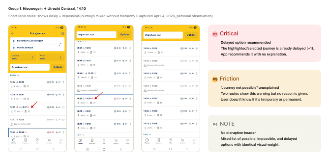
Group 1: Nieuwegein → Utrecht Centraal, 14:10

Short local route: shows delay and impossible journeys mixed without hierarchy (captured April 4, 2026, personal observation).
Group 1 audit screenshots, Nieuwegein to Utrecht Centraal
P2, Critical

Delayed option recommended

The highlighted, selected journey is already delayed (+1). The app recommends it with no explanation.

P5, Friction

"Journey not possible" unexplained

Two routes show this warning but no reason is given. The user doesn't know if it's temporary or permanent.

P4, Note

No disruption header

A mixed list of possible, impossible, and delayed options with identical visual weight.

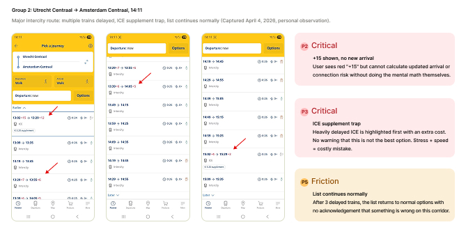
Group 2: Utrecht Centraal → Amsterdam Centraal, 14:11

Major intercity route: multiple trains delayed, an ICE supplement trap, list continues normally (captured April 4, 2026, personal observation).
Group 2 audit screenshots, Utrecht Centraal to Amsterdam Centraal
P2, Critical

"+15" shown, no new arrival

The user sees a red "+15" but cannot calculate the updated arrival or connection risk without doing the mental math themselves.

P3, Critical

ICE supplement trap

A heavily delayed ICE is highlighted first with an extra cost, with no warning that it isn't the best option. Stress plus speed equals a costly mistake.

P5, Friction

List continues normally

After 3 delayed trains, the list returns to normal options with no acknowledgement that something is wrong on this corridor.

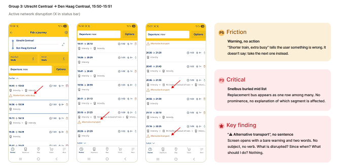
Group 3: Utrecht Centraal → Den Haag Centraal, 15:50, 15:51

Active network disruption, marked with an X in the status bar.
Group 3 audit screenshots, Utrecht Centraal to Den Haag Centraal
P5, Friction

Warning, no action

"Shorter train, extra busy" tells the user something is wrong. It doesn't say to take the next one instead.

P3, Critical

Snelbus buried mid-list

A replacement bus appears as one row among many, with no prominence and no explanation of which segment is affected.

Key finding

"Alternative transport", no sentence

The screen opens with a bare warning and two words. No subject, no verb. What is disrupted? Since when? What should I do? Nothing.

The same pattern appeared across all three routes. Disruption information was shown as scattered pieces like "+7 minutes," "journey not possible," or "alternative transport," without explanation or clear priority. The app was not broken, it just wasn't designed for this situation.

Research Findings

Six pain point clusters

Sourced from App Store, Google Play, Trustpilot, and Reddit reviews.

Critical: failure at the moment of highest stress

Critical, P1

Notification failure

No push alert when a train is cancelled. Users find out by manually refreshing, or at the platform.

"NS cancelled my train. I saw it because I constantly refreshed. No notification was sent."
Critical, P2

Vague delay information

Shows only "X minutes late," no revised arrival time. Users cannot make decisions without this.

"Doesn't show new arrival time, just an estimate of how many minutes late. Old tech."
Critical, P3

No alternative routing

After cancellation, no rerouting is offered. Users must manually search while stressed and time-pressured.

"5 min delay, then cancelled. Hundreds of people. No alternative plan offered at all."
Friction, P4

Out-of-sync information

The app, station boards, and PA show different delay times. Users don't know which source to trust.

"Monitors on the train don't sync with the app. Which one is correct?"
Friction, P5

Hidden faster alternatives

The app doesn't surface the fastest route. Alternatives at transfer stations are not shown proactively.

"Doesn't show new arrival time, just an estimate of how many minutes late. Old tech."
Friction, P6

No alternative routing

After cancellation, no rerouting is offered. Users must manually search while stressed and time-pressured.

"5 min delay, then cancelled. Hundreds of people. No alternative plan offered at all."
Core insight

The NS app was designed for the normal journey. It has no disruption-specific UX layer, no dedicated screen state, no stress-aware communication, no decision support. When disruption happens, users are abandoned at the moment they need guidance most.

Personas

Two NS disruption users

Both are based on real NS user behaviour from the research, not just assumed profiles.

LV

Layla van den Berg

Administrative coordinator, commutes daily
Daily commuter
RouteNieuwegein → Utrecht
Frequency5 days a week
App useConfident, daily

Layla has taken the same bus-to-train connection from Nieuwegein to Utrecht Centraal every workday for three years. She knows the timetable by heart. She opens the NS app only when something feels off, a delayed departure board, an unusual crowd at the stop.

Goals during disruption
  • Know immediately whether she will be late, not approximately, exactly
  • Find the fastest alternative without having to think through the network herself
"Just tell me which train to take. I don't need the whole list, I need one clear answer."
Core frustration

The app shows "+7 minutes" in red but doesn't tell her whether she'll still make her connection at Utrecht. She has to calculate it herself while standing at a cold bus stop, already running late.

Behavioural insight

Experienced commuters don't browse, they scan for one signal. When disruption happens, they need a single trusted answer, not more data to process.

HB

Hendrik Brouwer

Retired teacher, travels to visit family
Occasional traveler
RouteVaries by visit
Frequency2 to 3x per month
App useBasic, cautious

Hendrik travels by train to visit his daughter in Den Haag and his son in Amsterdam a few times a month. He plans his journey carefully in advance, prints or screenshots his itinerary. He is not familiar with alternative routes and relies entirely on what the app tells him.

Goals during disruption
  • Understand what has changed and whether his planned journey still works
  • Know what to do next in plain language, not transport jargon
"I saw something about a replacement bus but I didn't understand where to go. I just waited and hoped."
Core frustration

"NS Snelbus instead of train" appears in his journey list with no explanation of where to board, how to recognise it, or whether his OV-chipkaart still works. He doesn't know if he should wait, walk, or ask someone.

Behavioural insight

Occasional users with low tech confidence don't explore the app under stress, they freeze. If the first screen doesn't give them a clear, actionable instruction, they disengage from the app entirely and look for a human to help instead.

Scope

What this project focuses on

In scope

  • Disruption notificationThe push alert and in-app banner when a train is delayed or cancelled.
  • Real-time journey statusThe live view of a saved trip: delay severity, platform changes, updated arrival time.
  • Alternative route suggestionA proactive rerouting screen when a cancellation affects the user's saved journey.

Out of scope

  • Ticketing and booking
  • OV-chipkaart management
  • Subscription settings
  • Seat reservations
  • Delay compensation claimsNoted as a future design opportunity
Emotional Journey Map

Following one disruption scenario

A saved morning trip is cancelled during the commute. It follows Layla, the daily commuter, because her situation is the most time-sensitive and stressful. The main design focus is on stages 03, 04, and 05.

01, Departure

Leaves home, opens app

Checks journey as usual. Everything looks normal.

"On time, good."
Calm
02, At the stop

Waiting at the bus stop

Bus is 1 minute late. Checks app again, sees "+1" in red on her selected journey.

"Minor delay, still fine."
Slightly alert
03, Delay grows

App updates to +7

Delay counter jumps, no explanation, no revised arrival shown. She does the mental math herself.

"Will I still make my connection?"
Anxious
04, No guidance

Searches for alternatives

Manually opens planner, types route again, scans list. Sees "Journey not possible" on two options.

"Which one do I take? Why is this not possible?"
Stressed
05, Breakdown point

Train cancelled

No notification received. She sees it only when manually refreshing at the platform. No next step offered.

"I had no idea. Now what?"
Frustrated, lost
06, Resolution

Figures it out alone

Takes next available train after manually searching. Arrives 22 minutes late. Texts her manager.

"The app was useless when I needed it most."
Resigned
Emotional curve: Calm → Alert → Anxious → Stressed → Frustrated → Resigned
01 02 03 04 05 06

What the app failed to do, and what it should have done

Stage 03, missed

No updated arrival time shown. The user is forced to calculate the delay's impact herself, under stress.

Stage 03, opportunity

Show the updated arrival and flag connection risk automatically: "You may miss your connection."

Stage 04, missed

No proactive alternative suggestion. The user must manually research while time-pressured.

Stage 04, opportunity

Surface one clear recommended alternative, not a list. One tap to switch.

Stage 05, missed

No cancellation notification sent. The user discovered it herself at the platform, too late to act.

Stage 05, opportunity

An instant push notification with the cancellation reason plus the next best option, already loaded.

Each missed moment has a direct design response. These three stages became the focus of the entire redesign.

Design Principles

Four principles, not general UX rules

Defined before starting in Figma. Each one came from a breakdown moment in the journey map, and guides every design decision that followed.

Principle 01

Show one clear answer, not a list

During disruptions, users are already under time pressure and mental load. Showing multiple options can increase stress instead of helping. The app should handle the complexity and present one clear recommended action.

Derived fromJourney map stage 04, where Layla opens the planner and faces a long list of options while feeling stressed and short on time. Supported by research findings P3 and P5.
  • Show one clear recommended option first, keep other options hidden or secondary below
  • Avoid a long list where all disrupted journey options look the same
  • Use one clear main CTA, such as "Take this train," instead of something vague like "View options"
Principle 02

Show what it means, not just the numbers

A delay like "+7 minutes" is just data. Saying "You will arrive at 09:14, which is 7 minutes late" gives the user something they can understand and act on.

Derived fromJourney map stage 03, where the delay updates without explanation and the user has to figure out the connection risk on their own. Supported by research finding P2.
  • Always show the updated arrival time, not just the delay
  • Automatically highlight connection risk, for example "You may miss your connection at Utrecht"
  • When the delay is more than 10 minutes, replace "+15" style indicators with a clear explanatory sentence
Principle 03

Notify the user before they ask

Users should not have to refresh the app to discover a cancellation. Even early, imperfect updates build more trust than accurate information that arrives too late.

Derived fromJourney map stage 05, where no notification is received and the cancellation is discovered too late to act. Supported by research finding P1.
  • Send a push notification as soon as a saved journey is affected
  • Include the reason, the updated status, and one suggested action in the notification
  • Show an in-app disruption banner before the user opens their saved journey
Principle 04

Use plain language instead of transport jargon

Terms like "NS Snelbus" or "alternative transport" are unclear, especially when users are stressed. Messages should be written in simple language, like something you'd say to a friend.

Derived fromHendrik's frustration shows that he saw information about a replacement bus but did not understand what to do or where to go. Supported by research findings P3 and P4.
  • Say "A bus replaces the train between Utrecht and Gouda" instead of "NS Snelbus instead of train"
  • Always tell users where to board the replacement transport, not just that it exists
  • Write disruption messages as full sentences with a clear subject and verb, not just short labels

These principles create a real tension. Showing less can conflict with showing more. The solution is to adapt to the situation: during disruption, show one clear action, in the detail view, show the full information. The behaviour changes based on urgency, not the screen.

Information Architecture

What is new, what already exists

The redesign adds a disruption layer on top of the existing planner. It does not add new navigation or a new tab. It only appears when a saved journey is affected, and stays hidden when everything is normal.

Planner
Existing
Departures
Existing
Map
Existing
Tickets
Existing
More
Existing
New state, OS level

Push notification for affected journey

Sent as soon as a saved journey is affected, with the reason, status, and one suggested action.

New screen

Alternative route screen with best option

Replaces the normal journey view during disruption, showing what happened, the impact, and one recommended action.

New screen

Alternative route screen

Shows one clear alternative with departure time, platform, and updated arrival, with other options collapsed and a single tap to switch.

Modified state

Journey list

Adds a disruption banner at the top when the route is affected, showing updated arrival times instead of just delays.

Modified state

Journey detail

Shows the delay as a full sentence, flags connection risk, and highlights any platform change.

Modified state

Saved journeys in My Trips

Disrupted saved journeys are flagged with an amber indicator. Tapping leads to the disruption alert screen.

User flow when a saved journey is disrupted

1

User receives a push notification such as, "Your 08:22 to Utrecht is cancelled. Take the 08:31 instead" and taps it.

2

The disruption alert screen opens, showing what happened, the updated arrival time, and the impact on the journey, with one clear main action: "See alternative."

3

The alternative route screen shows one recommended train with departure time, platform, and new arrival, with a secondary option to see other routes.

4

User confirms the new route. The alternative is saved to the journey, the user heads to the platform, and the flow is completed in under three taps.

The full flow, from notification to confirming an alternative, takes less than three taps. This was an intentional decision.

Wireframes

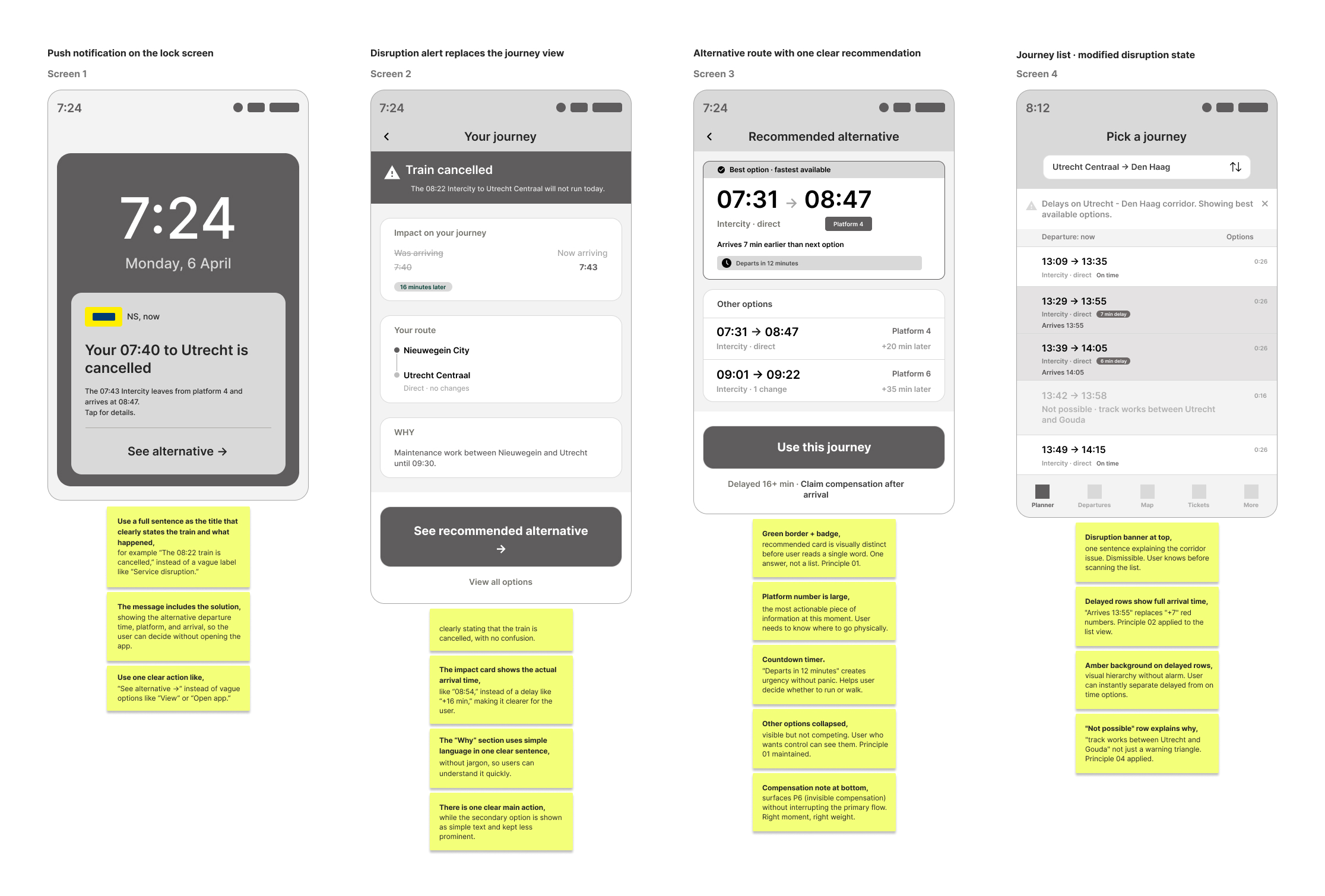
Four screens, low-fidelity

Created before any visual design. Each screen focused on one task: what the user needs to do at that moment, and the minimum information needed to do it.

Clear Path low-fidelity wireframes, four screens with annotations

Screen 1, push notification on the lock screen. Screen 2, disruption alert replaces the journey view. Screen 3, one recommended alternative with other options collapsed. Screen 4, the journey list in its modified disruption state.

Usability Testing

Testing at the wireframe stage

Three participants from my network were selected to match the personas. Each session was task-based, lasted about 15 to 20 minutes, and I observed without intervening.

3
Participants
4
Screens tested
20'
Per session
1
Scenario

Participant 1, Yasmine

32, marketing coordinator, daily commuter between Utrecht and Amsterdam, uses the NS app every day.

Matches Persona 1, Layla

Participant 2, Fatima

28, graduate student, irregular NS user, generally familiar with mobile apps.

Mixed, additional perspective

Participant 3, Willem

67, retired, travels by train two to three times a month to visit family, moderate confidence with apps.

Matches Persona 2, Hendrik
"It's Monday morning. You're about to leave for work. You look at your phone and see this. Show me what you would do."
Finding 01, Screen 3, critical

The recommended option appears again in "Other options."

2 of 3 participants were confused when the same journey appeared in both the recommended option and the "Other options" list, making it unclear which one to choose.

Finding 02, Screen 3, critical

The recommendation hierarchy wasn't clear for users with low confidence.

Participant 2, who matched Persona 2, didn't immediately understand that the recommended card was the main suggestion. They looked through other options first, then returned, still unsure.

Finding 03, Screen 2, friction

The strikethrough on "was arriving" wasn't clear enough.

Participants 1 and 2 had to read the impact card more than once to understand the before and after times. The contrast between old and new arrival needed to be stronger.

Finding 04, Screen 4, friction

The disruption banner wasn't strong enough visually and was missed by one participant.

Participant 2 scrolled past the banner without noticing it. The amber colour didn't stand out enough from the white background to catch attention before the journey list.

Finding 05, all screens, positive

The "Why" section was useful for all participants.

All three participants responded positively to the plain-language reason card. Participant 2 said it made him feel less anxious, which strongly supports Principle 04.

Finding 06, Screen 1, positive

The push notification was clear and easy to understand right away.

All three participants understood the notification immediately without needing to read it again, including the train time in the title.

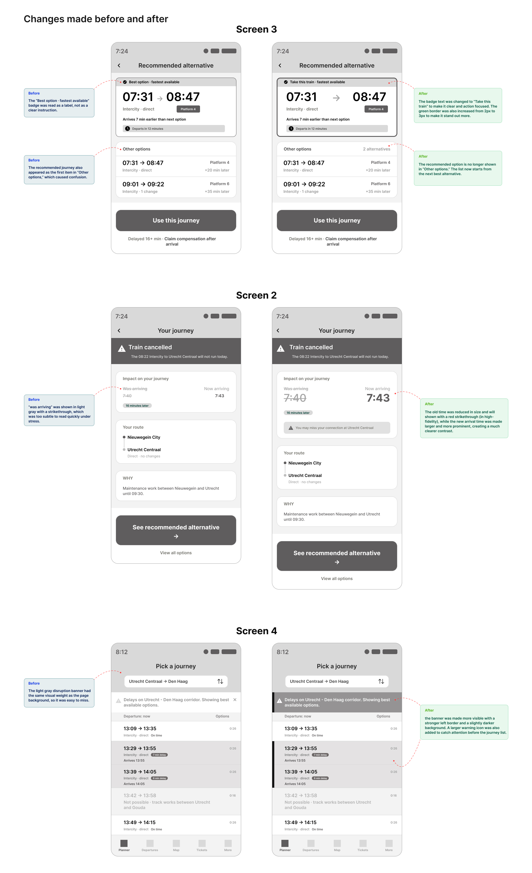
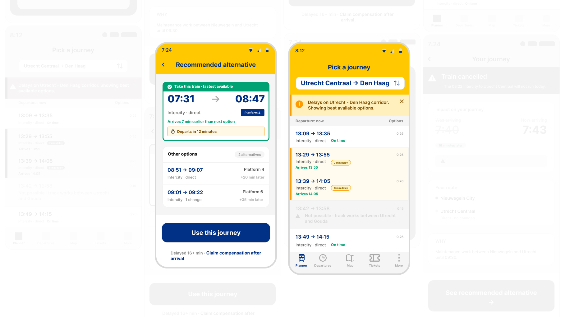
Changes made before and after

Clear Path before and after comparison for screens 2, 3, and 4 following usability testing

Two findings were critical and required immediate changes. Two showed smaller issues that needed refinement. Two confirmed that the design direction was working. Every change in the final design comes from a specific observation, nothing was changed just for visual reasons.

High-Fidelity UI

Four screens, final visual design

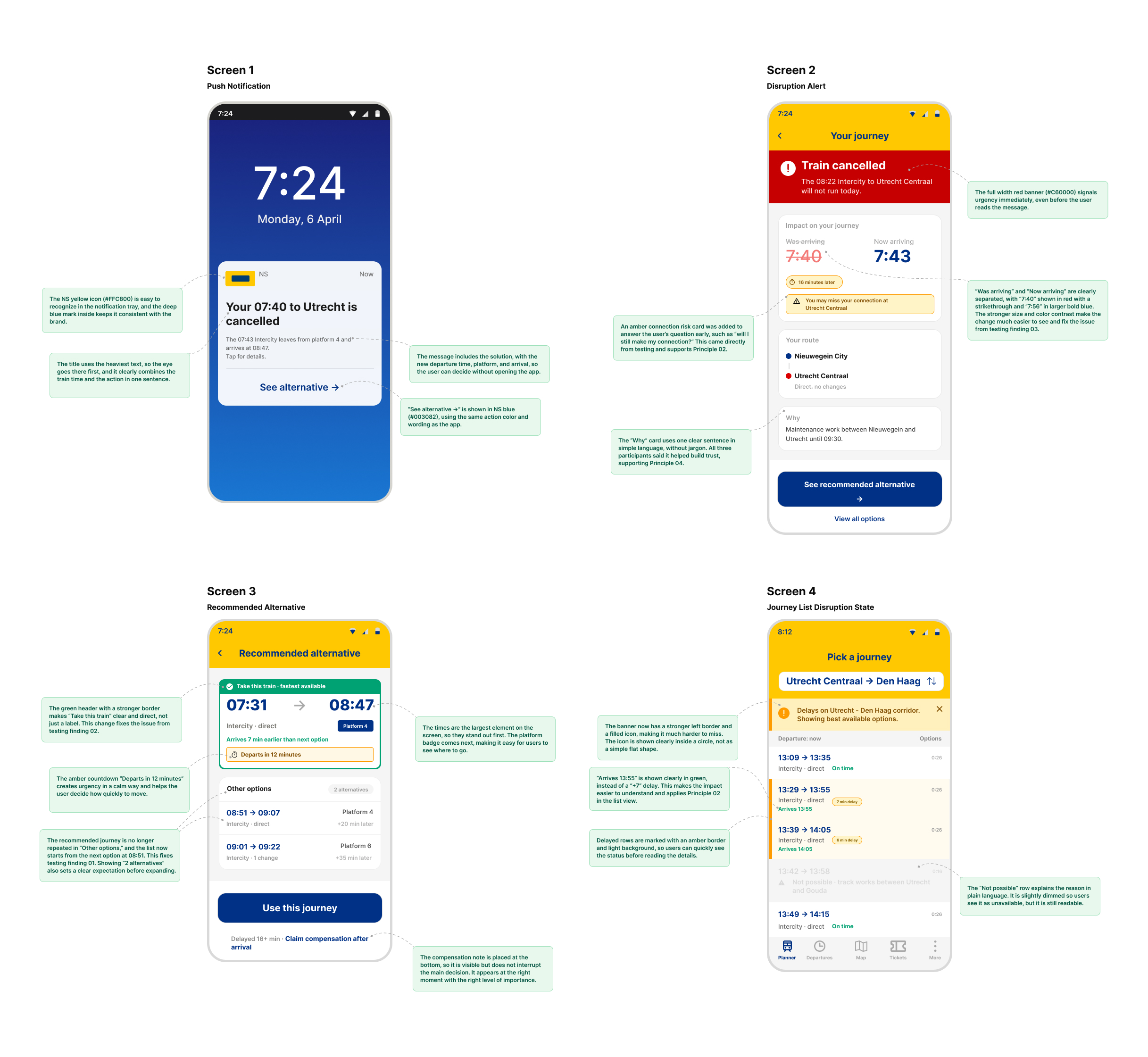
The high-fidelity screens follow the NS visual style: yellow headers, deep blue text, and clear status colours, while introducing new disruption states that aren't part of the current app. Each decision is linked to a specific principle and a testing insight that informs it.

Clear Path high-fidelity UI, four final screens with annotations

Screen 1, push notification. Screen 2, disruption alert. Screen 3, recommended alternative. Screen 4, journey list disruption state. Each decision on these screens ties back to one of the four design principles and a specific usability-testing insight.

Prototype

A clickable mobile prototype

Exploring how NS could guide passengers through real-time train disruptions, from push notification to alternative journey selection. Designed in Figma and implemented as an interactive coded prototype.

Outcome & Reflection

What this redesign changed

Flow length
3 taps

From notification to confirming an alternative, the full disruption flow takes less than three taps.

Screens designed
4 new

Two new screens and two updated states, with no new navigation or tabs added.

Pain points addressed
5/6

Five of the six research pain points are directly addressed. P6, about compensation, is made visible but not fully designed, as a deliberate scope choice.

What the redesign changes

The current NS app treats disruption as a data problem, showing delay numbers, labels, and status codes. The redesign treats it as a communication problem. The same information is written as clear sentences and organised around what the user needs to do next. This reduces mental effort at the moment it matters most, instead of trying to understand "+7 minutes" under pressure, users see "Arrives 7:56, 16 minutes later" and one clear action. This shift, from raw data to clear guidance, is the core idea of this project.

What I learned

The most important insight was not about UI patterns, but about how stress affects how people understand information. At first, I thought giving more information would help users feel in control during disruption, testing showed the opposite: more options and more visual complexity made people more anxious. The design became less about adding and more about removing. Principle 01, one clear answer instead of a list, came directly from this. I watched a participant scan a long list of delayed trains while stressed, then relax as soon as she found the one she needed. That moment shaped the whole direction of the project.
Disruption is not a rare case for NS users. It happens regularly, and the app should reflect that. The goal is not to prevent disruption, but to help users move through it. Clear Path is a proposal for how that experience could work.

What I would do next

Accessibility testing

The disruption states rely a lot on colour, such as amber rows, red banners, and green recommendations. These need to be tested with colour-blind users and screen readers before moving forward.

Design the compensation flow

P6 was identified but not fully solved. A follow-up screen after the journey, triggered when a delay of more than 30 minutes is detected, could complete the experience.

Tappable prototype testing

Static screens don't show the real-time pressure of a disruption. A clickable prototype tested under time pressure would reveal issues that static testing cannot.

Replacement bus guidance

The "NS Snelbus" case, where a bus replaces part of the train journey, is still not designed. A clear boarding guidance screen would be the most important next step, especially for Persona 2.

This project was developed with support from AI in research synthesis and documentation, alongside my own design work, Figma execution, and personal observations from real NS use. AI was used as a thinking partner to structure findings, test ideas against defined principles, and speed up documentation. All design decisions, visuals, and the overall direction of the case study are my own.