Graphic Design · Roads & Transportation Department · Zanjan
Motion Graphics
Two road safety motion graphics for the Roads & Transportation Department of Zanjan — designed to communicate the human cost of distracted driving and helmet non-use through icons, sound, and visual language alone, regardless of audience language.
Client
Roads & Transport Dept.
Category
Motion Design
Output
Broadcast + Social
Language
Universal / No text
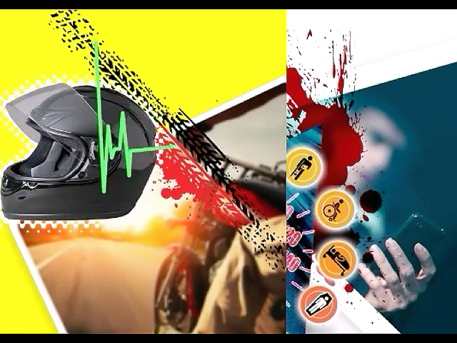
↑ Still frames — distracted driving (right) and helmet safety (left) motionGraphics · Roads & Transportation Department · Zanjan
01
Project Overview
Two motion graphics produced for the Roads & Transportation Department of Zanjan province, targeting road safety awareness across broadcast and social media channels. The brief called for pieces that communicate urgency and consequence immediately — without relying on language, subtitles, or any text that would limit reach across different audiences.
The design constraint was also the central creative opportunity: the entire message had to be carried by icons, sound design, colour, and motion alone. A viewer who speaks no Persian must feel the meaning before the film ends.
"No text. No translation required. The icons, sounds, and motion carry the message to any audience, in any language."
02
The Two Films
Film 01 — Distracted Driving
Phone notification → crash → progressive disability icons → flatline. The narrative arc makes the human cost of a single distraction visceral and immediate — compressing a life-altering sequence into seconds.
Film 01 — Distracted Driving · Roads & Transportation Department · Zanjan
Film 02 — Helmet Safety
The same audio-visual language applied to motorcycle helmet use — the presence or absence of a helmet shown as the single variable between survival and consequence. The flatline motif and progressive disability icons repeat, building a recognisable system across both pieces.
01
Rider, no helmet
The motorcycle, the road, the missing protection.
02
Crash
Impact visualised — sound and colour do the work.
03
Consequence icons
Progressive outcome sequence — the same icon language as Film 01.
04
Flatline
Heartbeat → silence. The helmet, shown.
Film 02 — Helmet Safety · Roads & Transportation Department · Zanjan
03
Design Approach
The central design constraint — no text, no language — required that every element carry communicative weight on its own. Colour, icon sequence, timing, and sound had to do what words usually do. The result is a visual system that functions as a shared vocabulary across two films.
Visual Language
Icons over words
Universal iconography — phone, wheelchair, stretcher, heartbeat monitor — communicates consequences without any text. Each icon is instantly readable across cultures and languages.
Narrative Arc
Cause → consequence
Both films follow the same compressed arc: a single human decision, an immediate crash event, a cascade of consequences. The brevity makes the sequence feel inevitable rather than instructional.
Sound Design
Audio as punctuation
Notification sound, impact crash, heartbeat rhythm, flatline tone. The audio arc mirrors the visual one — sound alone could narrate the story without the image.
Colour System
Yellow / red / teal
High-contrast palette: alert yellow signals life and normalcy; red signals rupture and danger; teal anchors the icon system. The colour shift from yellow to red carries the emotional turn without words.
Shared System
Two films, one language
The flatline motif, icon progression, and colour system repeat across both films — building a recognisable visual language for the Roads Department's road safety communications.
Distribution
Broadcast + social
Produced for both broadcast TV and social media channels — format, pacing, and file specs adapted for each medium while the core message remains identical.
"A road safety message that only works in one language reaches half the audience it could. These films were designed to work without any language at all."