Interior Design · Residential · Tehran
A design challenge involving non-parallel zigzag walls with no standard long surfaces — resolved through a custom counter and island layout that achieves both functionality and visual coherence.
01 — Project Overview
The kitchen space presented an unusual structural challenge: the room's walls are non-parallel, forming a zigzag floor plan with no continuous straight run long enough to support a conventional kitchen layout. Standard cabinet rows — which depend on parallel walls and a predictable corner geometry — would not work here.
The design response was to treat the irregular boundaries as an opportunity rather than a constraint. A custom counter layout was developed to follow the perimeter geometry exactly, while a freestanding island was introduced to create a visual anchor at the centre of the room and add a social surface independent of the walls.
"The zigzag plan meant every cabinet run, every corner, every countertop edge had to be drawn fresh. There was no template to follow — the layout had to be invented from the room outward."
02 — The Challenge
A standard kitchen relies on at least one long, straight wall to anchor a continuous worktop run. The irregular plan here offered no such luxury. The walls change direction at multiple points, meaning the countertop had to follow a non-linear path — requiring custom-cut surfaces, non-standard corner joints, and careful sequencing of the appliance positions to ensure workflow logic was not broken by the geometry.
The challenge was compounded by the need to integrate a washing machine within the kitchen footprint, position the extractor hood correctly over the hob despite an off-axis wall, and introduce the tall open shelving unit in the only column-free vertical surface available — the narrow end wall to the right of the cooking zone.
Floor plan — irregular wall geometry with counter and island layout
03 — Design Response
Three spatial moves resolved the irregular plan. First, the perimeter counter was designed as a series of connected custom segments, each cut to follow the wall direction — creating a continuous worktop surface that reads as a single flowing line despite the underlying zigzag. Second, the freestanding island was positioned orthogonally to the primary entry axis, introducing a right-angle reference that visually stabilises the room. Third, the tall open shelving unit on the right-hand wall acts as a full-height vertical element, grounding the space and providing storage density without requiring additional wall length.
04 — Design Language
The material palette was chosen to introduce warmth into what is architecturally a complex and potentially disorienting space. The walnut veneer on the lower cabinets and island brings a natural, grounding tone to the lower half of the room. The grey upper cabinets keep the upper zone light and recessive, preventing visual heaviness above eye level. White countertops and white wall tiles form a neutral middle ground that both palettes can read against clearly.
The red bar stools at the island introduce the only saturated colour in the space — functioning as a deliberate accent that draws the eye to the social zone and signals the island's dual role as both a work surface and a place to sit.
The red stools are the only saturated colour in the space — a deliberate signal that the island is both a work surface and a social space. The accent colour also makes the island legible as the room's focal point when viewed from the entry.
05 — Visualisation
The kitchen was visualised in three camera positions, each chosen to test a different reading of the space: the tight working view from within the cooking zone, the wide angle from the entry showing the full island and shelving unit, and the three-quarter view that best communicates the relationship between the perimeter counter run and the central island.
View from cooking zone — island, red stools, and open shelving unit beyond
Wide entry view — island foreground, full perimeter counter in background
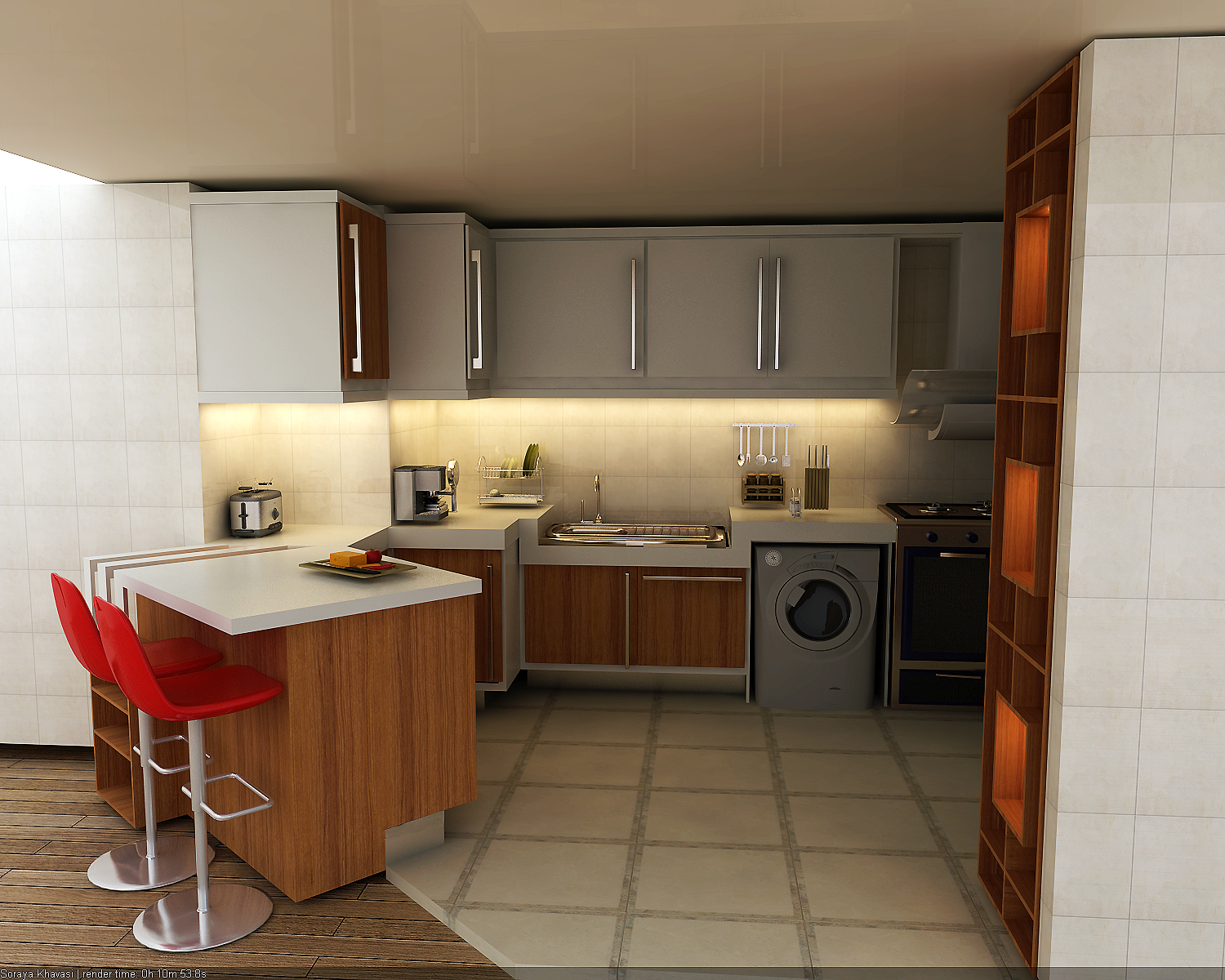
Three-quarter view — counter-to-island spatial relationship
06 — As Built
The kitchen was built to the designed specification. Site photography documents the completed installation — showing the custom counter joinery, the island unit, the under-cabinet lighting system, and the tall open shelving unit in their final built form.
Built kitchen — site photography (images to be added)
Built kitchen — full room view (image to be added)
07 — Role & Process
The design process ran from site survey and spatial analysis through to full 3D visualisation and construction documentation. The irregular floor plan was surveyed and modelled exactly, with every non-standard angle and wall transition mapped into the design model before any cabinet layout was attempted.
The 3D renders were produced in V-Ray to full photorealistic quality — used both for client sign-off and as construction guidance for the cabinet makers. Each render was set up to communicate not only the visual outcome but the spatial logic: how the island and perimeter counter relate, where the lighting falls, and how the material palette reads under warm artificial light.
Tools: 3ds Max · V-Ray · AutoCAD